
Update QR Code Branding After Printing: NIST & GS1 for Marketers


Branded QR codes carry your logo, colors, and frame while still scanning on the first try, and the single highest-impact move is pairing dynamic QR codes with function-first styling. That combination lets you update destinations after printing, track every scan, and keep the code legible under real lighting. Everything else, including logo size and color choice, is secondary to that scan success rate.
TL;DR:
Dynamic branded QR codes with function-first styling increase scan reliability and allow destination updates after printing, making campaigns more adaptable.
High contrast color schemes and small, centered logos that do not cover finder patterns are essential for both readability and maintenance of scanning success.
Using branded, short redirects with UTM parameters enables detailed campaign tracking, while GS1 Digital Links support content updates without changing the code.
Proper printing tests, such as checking contrast and scanability on actual materials and devices, are critical before full deployment.
Tracking unique scans and conversions helps optimize landing pages and understand the real impact of campaigns beyond pure scan volume.
Table of Contents
Design rules for branded QR codes: logo, color, and error correction
Technical choices: static vs. dynamic, short redirects, and GS1 standards
Accessibility and legibility: color, contrast, and layout rules
Placement and printing proofing: sizes, materials, and testing
Measurement and optimization: tracking scans and conversions
Implementation checklist: step-by-step for a branded QR campaign
Why brand QR codes: benefits and use cases that matter
A branded QR code does double duty: it points guests somewhere useful and reinforces who sent them there. When a code carries your colors and a familiar frame, customers trust it faster, especially on a tabletop or a product label where unbranded black-and-white squares look generic or even suspicious.
Dynamic codes add flexibility: you can swap a destination for a new menu, a seasonal promotion, or a different language without reprinting anything.
Restaurant and bar menus that replace laminated cards and update daily without new print runs.
Packaging and retail displays that link to product stories, allergen information, or loyalty sign-ups.
Print ads, posters, and event signage that drive traffic to a landing page built for that specific campaign.
Social profiles, vCards, and Wi-Fi access points that save guests a few taps at check-in.
Each use case opens a measurement opportunity: scans tied to a campaign tell you which placement and which creative actually moved people to act.
Where a QR should take people: landing pages that convert
The destination matters more than the design. A code that looks sharp but drops guests on a slow, generic homepage wastes the scan. Match the destination to the objective and to how often that content changes.
A branded, mobile-first landing page works best for campaigns with a single call to action, like a promotion or event RSVP.
A QR menu suits hospitality settings where content changes often and guests expect to browse quickly.
A vCard or social profile link fits networking and small-business cards where the goal is a follow or a saved contact.
A direct video link can shorten the path for product demos but offers little room for a secondary message.
Dynamic, updatable redirects matter because printed codes are permanent while your campaigns are not. For packaging that carries a persistent product identifier, GS1 Digital Link is the better fit since it lets the code represent the product itself while the linked content changes behind the scenes. For a one-off marketing push, a short branded redirect is simpler to manage and just as measurable.
Design rules for branded QR codes: logo, color, and error correction
Good QR branding never compromises the scan. Keep the logo small and centered, never covering the three large corner squares that scanners use to find the code, and preserve a clean quiet zone (blank margin) around the whole symbol.
Color choice should serve function, not decoration. NIST guidance on color use warns against using color purely for decoration and recommends strong luminance contrast between the code and its background, since low contrast is a common reason scans fail. Stick to a simple, high-contrast palette drawn from your brand colors rather than a full gradient.
Frames and short calls to action (“Scan for Menu,” “Scan to Order”) increase intent by telling people exactly what happens next, which raises scan rates more reliably than visual polish alone.
Keep the logo under roughly 20% of the code’s total area and centered.
Maintain a clear quiet zone (blank margin) around the whole symbol to ensure scanability.
Use strong luminance contrast with a simple, high-contrast palette instead of similar-toned colors.
Add a short, direct call to action next to or inside the frame.
Pro Tip: Print a test sheet with three logo sizes and scan each with at least three different phone models before approving the final file.
Before sending any branded code to print, run a short proofing pass: confirm contrast, confirm the logo does not block finder patterns, confirm the call to action is legible at the final print size, and confirm a scan test on both iOS and Android.

Technical choices: static vs. dynamic, short redirects, and GS1 standards
Static QR codes encode a destination permanently, so any change means a new code and a new print run. Dynamic QR codes encode a short redirect you control, which means you can edit the destination, run analytics, and fix typos without touching the printed material. For marketing campaigns, dynamic is the practical default.
Use a short, branded redirect domain rather than a generic shortener so the link itself reinforces your brand.
Add UTM parameters to every redirect so campaign performance shows up clearly in your analytics.
For product packaging, use a GS1 Digital Link URI hosted on a dedicated subdomain, which GS1’s best-practice documentation recommends for keeping the printed code valid even as the linked content changes.
Treat marketing redirects and product identifiers as separate systems: one serves a campaign, the other serves a SKU for the life of the product.
All of this sits on top of the underlying symbol format. ISO/IEC 18004:2024 is the formal specification for QR code symbology, covering encoding, error correction levels, and production quality. Any custom styling, including logo insertion, should be validated against those error correction rules rather than against guesswork.
Accessibility and legibility: color, contrast, and layout rules
Branding should never come at the cost of someone’s ability to scan the code. NIST’s accessibility and color guidance recommends using color only where it serves a function, maintaining strong luminance contrast, and duplicating any color-coded meaning with shapes or text labels rather than color alone.
For QR codes specifically, that means never relying on a brand color alone to signal “scan here.” Pair color with a label or icon, and check that your palette holds up for readers with common color vision deficiencies by viewing a grayscale version of the design before approval.
Layout matters too. NIST research on printed-ballot legibility documents how placement and zoning affect whether a code gets noticed or skipped by readers and assistive tools, a finding that applies directly to menus, posters, and packaging.
Always test a black-and-white fallback before finalizing brand colors.
Duplicate any color meaning with a label, icon, or text cue.
Give the code its own clear zone, separated from dense surrounding text or images.
Placement and printing proofing: sizes, materials, and testing
Size and material decide whether a well-designed code actually scans. A tabletop menu code can run small, roughly 2 by 2 inches, while a poster viewed from several feet away needs a proportionally larger symbol, and packaging needs enough quiet zone to survive curved or glossy surfaces. Our QR code sizing guide for restaurant menus breaks down exact sizes by distance and surface.
Confirm the minimum size for the viewing distance and surface type.
Check the quiet zone against the printed background, not just the digital proof.
Test on glossy, matte, and curved samples if the final material varies.
Scan the physical proof with at least two device types under normal lighting.
Approve only after a successful scan on the actual print stock.
Measurement and optimization: tracking scans and conversions
A scan count alone tells you little. Watch unique devices, conversion rate on the landing page, and patterns by location and time of day to understand what is actually working. Dynamic QR platforms typically pair with UTM parameters and standard analytics dashboards, so each code’s performance shows up alongside the rest of your campaign data.
Track unique scans separately from total scans to spot repeat engagement.
Set a conversion event, such as an order or sign-up, not just a page view.
A/B test the call to action, frame style, or landing page content, one variable at a time.
Optimize for the action you wanted, not the scan itself. A code with a high scan count but a weak landing page is a design problem, not a QR problem.
Implementation checklist: step-by-step for a branded QR campaign
A repeatable process keeps branded QR campaigns from turning into one-off print projects nobody can audit later.
Define the objective: order, sign-up, download, or information lookup.
Choose the destination type that matches that objective.
Generate a dynamic redirect with UTM parameters attached.
Design and proof the code against contrast, logo, and quiet-zone rules.
Print a test batch and scan it on real devices before full production.
Deploy across the intended placements.
Monitor scans and conversions weekly, then adjust the destination as needed.
Keep a simple record of each redirect URL, its UTM tags, and the date it was last changed. That record saves time during reprints and makes future audits straightforward.
How hospitality teams put branded QR codes to work
Restaurants, cafes, and hotels are a natural fit for branded QR codes because menus change constantly and guest attention is short, as explained in detail in Explaining Digital Reservations: What Every Traveler Should Know. A QR code menu that carries a venue’s own colors and logo, backed by a dynamic redirect, lets a team update dishes or prices without reprinting table cards. Pairing that with video-rich menu content, guest profile capture, and loyalty tracking turns a single scan into a measurable touchpoint rather than a static lookup. Our QR menu setup guide walks through getting a venue’s first branded code live.

A practical take from the field
If you only do one thing, make it dynamic QR codes with simple, high-contrast branding and a real scan test before printing. Pilot one use case, measure conversions rather than scans, and expand from there.
— Abhi
Build your branded QR menu with MyDigiMenu
We built our QR Menu product around exactly this approach: dynamic codes, brand-ready styling, and no app download required for guests. Pair it with our Tablet Menu for in-house ordering, or add The Hotel App for guest services beyond the table.
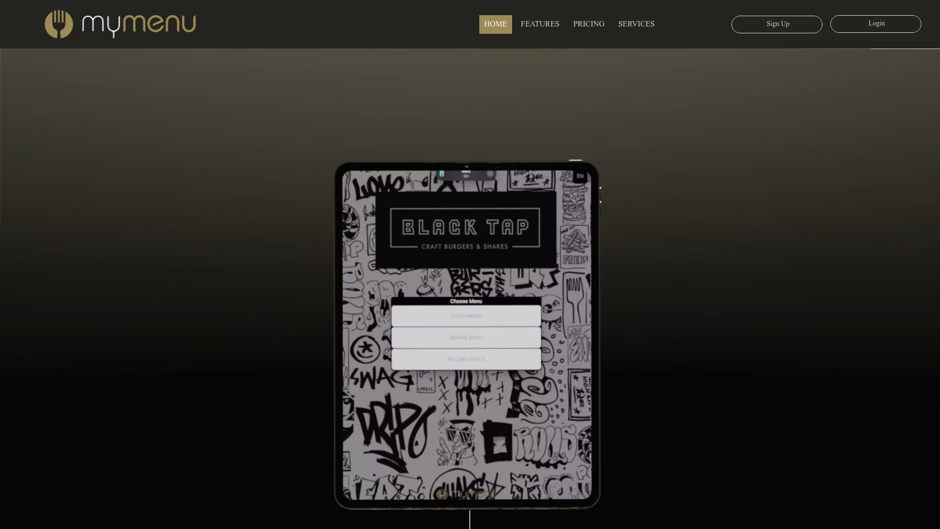
QR menus with customizable branding, video content, and no-app ordering.
CRM and loyalty tools that turn a single scan into a returning guest.
Plans are available starting at a monthly fee. See our pricing page for details.
Check our pricing page to find the plan that fits your venue and get a branded QR menu live this week.
FAQ
What is the FBI warning about QR codes?
The FBI has warned that scammers sometimes replace legitimate QR codes with malicious ones, redirecting victims to fraudulent sites that steal login or payment details. The safest defense is using dynamic codes you control, checking the destination URL before entering any information, and physically inspecting codes in public places for tampering or overlay stickers.
How do I make a cool-looking QR code?
Start with high contrast and a clean quiet zone, then add a small centered logo without covering the corner finder squares. Choose a brand color pair that still reads clearly in grayscale, and always test the final design on multiple devices before printing.
Is a QR code a registered trademark?
The QR code itself is a trademark of Denso Wave, the company that created it, though the technology is freely licensed for general use. The underlying symbology is standardized under ISO/IEC 18004:2024, which defines how the codes are structured and produced.
How much does a QR code cost for a business?
Pricing depends on whether you need a simple static code or a full dynamic QR platform with analytics and branding tools. Our QR Menu product is included in plans starting at $39 per month for the StartUp Menu tier, listed on our pricing page.
Should I use a static or dynamic QR code for marketing?
Dynamic QR codes are the better choice for marketing because they let you edit the destination and track scans after the code is already printed. Static codes are fine for one-time, permanent uses like a fixed Wi-Fi password where the destination will never change.
Sources
Recommended
What happens when a word puzzle meets your love for food? You get foodle, a game that looks innocent until one mysterious word completely destroys your confidence. It is simple to understand, quick to play, and surprisingly good at making your brain work harder than expected.
There's a reason I keep Slope Game 2 bookmarked instead of forgetting about it after the first visit. Whenever I have a few spare minutes, I know I can jump straight into an exciting challenge without waiting through updates or lengthy loading screens. That convenience, combined with rewarding gameplay, makes it an easy game to revisit throughout the week.
Not every character needs to have a perfect life. Sometimes the ridiculous ones make the best bitlife stories. 😂