
Optimize menu layout: boost engagement and profits 15%
- Abhi Bose
- Mar 28
- 8 min read


Most restaurant owners instinctively add more items when sales slow down, believing that a longer menu signals more value. It’s a logical assumption, but it’s also one of the most costly mistakes in the industry. Optimized menu layouts can increase restaurant profits by 10 to 15% simply through strategic placement of high-margin items in the right visual zones. This guide breaks down exactly how menu optimization works, why the science behind it is so compelling, and what practical steps you can take right now to transform your menu into a genuine revenue engine.
Table of Contents
Key Takeaways
Point | Details |
Smart layouts boost profit | Strategic item placement can increase profits by up to 15 percent for restaurants. |
Smaller menus sell more | Menus with fewer choices are proven to increase sales and lower guest overwhelm. |
Digital beats static | Dynamic digital menus outperform static PDFs by reducing abandonment and allowing easy updates. |
Continuous refinement wins | Using analytics and regular category reviews ensures your menu keeps improving. |
What does menu optimization mean?
Menu optimization is the practice of designing and organizing your menu to guide guest attention toward items that are both popular and profitable. It goes beyond aesthetics. It’s a data-informed process that combines psychology, design, and sales analysis to influence what guests order and how much they spend.
One of the most important concepts here is the golden triangle, a term used to describe the natural eye movement pattern guests follow when they first look at a menu. Research shows that eyes typically travel to the center first, then to the top right, and finally to the top left. Placing your highest-margin items in these zones increases the likelihood guests will notice and order them. Pair this with a solid menu design guide and you have a powerful starting point.
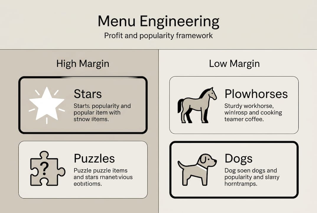
Closely related is menu engineering, a methodology that helps you evaluate every item on your menu through two lenses: popularity and profitability. As menu engineering methodology shows, items fall into four categories:
“Stars are high popularity, high profit. Plowhorses are popular but low margin. Puzzles are profitable but rarely ordered. Dogs are low on both counts.”
Stars: Promote prominently and protect their quality
Plowhorses: Consider raising prices or reducing portion costs
Puzzles: Improve descriptions or reposition on the menu
Dogs: Evaluate for removal to simplify your offering
Understanding these categories is the foundation of every smart menu decision you’ll make going forward.
How an optimized menu layout drives sales and efficiency
The numbers behind menu optimization are hard to ignore. Profits increase 10 to 15% with thoughtful layout changes, and TGI Fridays achieved a 5% same-store sales lift after a single menu redesign. These aren’t minor tweaks. They’re structural shifts that change how guests interact with your offering.
One of the most surprising findings is the power of language. Descriptive language boosts item sales by 27%. Calling a dish “slow-roasted garlic herb chicken” instead of just “roast chicken” creates a sensory experience before the food even arrives. Guests feel more confident in their choice, and they’re willing to pay more for it.
Smaller menus also outperform bloated ones. Menus with 15 to 20 items consistently drive higher sales because they reduce decision fatigue, the mental exhaustion guests feel when faced with too many choices. When guests feel overwhelmed, they default to the cheapest or most familiar option, which rarely benefits your bottom line.
Here’s a snapshot of how layout changes translate into measurable outcomes:
Optimization tactic | Estimated impact |
Golden triangle item placement | 10 to 15% profit increase |
Descriptive item language | 27% sales boost per item |
Reducing menu to 15 to 20 items | Higher average check value |
Strategic redesign (TGI Fridays) | 5% same-store sales lift |
Beyond revenue, optimized menus also boost guest engagement and speed up the ordering process. When guests find what they want quickly, table turnover improves and staff spend less time answering questions. Digital table ordering takes this even further by removing friction from the entire ordering journey. For a deeper look at the data behind these gains, menu engineering data offers compelling case study evidence.
“A well-engineered menu is the most cost-effective marketing tool a restaurant has. It works every single service, for every single guest.”
Pro Tip: Pull your POS (point-of-sale) sales report and rank every item by both order frequency and profit margin. Items that rank high on both are your Stars. Start there and make sure they’re positioned in your golden triangle zones.
Menu engineering framework: Categorize for profit
Applying menu engineering methodology in practice means getting comfortable with your sales data and making deliberate decisions for each item category. Here’s how to act on each one:
Category | Popularity | Profitability | Action |
Stars | High | High | Feature prominently, protect quality |
Plowhorses | High | Low | Reprice or reduce cost |
Puzzles | Low | High | Rewrite descriptions, reposition |
Dogs | Low | Low | Remove or replace |
To categorize your items, you need two data points for each dish: how often it’s ordered and how much profit it generates per sale. Your POS system should provide both. Once you have the data, plot each item into the four categories and build your action plan from there.
For Plowhorses, a small price increase of even one dollar can shift them toward Star territory without affecting order frequency significantly. For Puzzles, the fix is often as simple as a more vivid description or a better photo. Explore digital menu layout examples to see how visual presentation can reposition a Puzzle into a guest favorite.
Review your full item list every quarter
Use profit margin data, not just revenue, to evaluate performance
Test description changes before removing a Puzzle entirely
Remove Dogs decisively. A shorter, sharper menu always wins
Pro Tip: Set a calendar reminder every 90 days to run your POS report and re-categorize your menu items. Seasonal shifts in guest preferences can move a Star into Plowhorse territory faster than you’d expect.
Digital menu layouts vs. static PDFs: Real advantages
Once you’ve categorized and optimized your items, the format you present them in determines how agile your process can be. Static PDFs and printed menus lock you into a fixed layout. Every change requires a redesign, a reprint, and a delay. That’s a costly cycle when you’re trying to respond to real-time data.
Digital menus flip this entirely. Static PDFs cause 30% abandonment while digital menus enable A/B testing, real-time analytics, and personalization that static formats simply cannot match. A/B testing means you can show two versions of a menu section to different guests and measure which layout drives more orders of your high-margin items.
Here’s what digital menus make possible that PDFs never can:
Real-time updates: Change prices, add specials, or remove sold-out items instantly
Dayparting: Show a breakfast menu in the morning and a dinner menu at night automatically
Personalization: Surface items based on guest history or preferences
Analytics: Track which items guests view most and where they drop off
Mobile-first design: Optimized for the device most guests already have in their hands
Restaurants that digitalize restaurant operations gain a significant competitive edge because they can act on data immediately rather than waiting for the next print cycle. The ability to streamline ordering workflow through a well-designed digital interface also reduces errors and speeds up service in ways that static menus never could.
From design to action: Best practices for menu layout in 2026
Knowing the theory is one thing. Putting it into practice is where the real gains happen. Here are the best practices that industry leaders use to keep their menus performing at their peak.
Limit each section to 5 to 7 items. Limiting sections prevents decision fatigue and keeps guests focused on your best offerings.
Use white space intentionally. Crowded menus feel overwhelming. White space draws the eye to featured items and signals quality.
Write sensory descriptions. Every high-margin item deserves a description that makes guests taste it before they order it.
Add visual cues. Icons, borders, or subtle shading can highlight profitable items without feeling pushy.
Match layout to your service style. Align layout with concept: single-column layouts work well for focused, upscale concepts, while grid layouts suit quick-service restaurants where speed and scanning matter most.
Go mobile-first. Design your menu for a phone screen first, then adapt for larger formats.
Test and refine quarterly. Use your POS data to measure the impact of every layout change and adjust accordingly.
For a practical walkthrough of building your first optimized digital menu, creating digital menus is an excellent starting point.
“The best menus aren’t the longest or the most beautifully printed. They’re the ones that make the right choice feel obvious to every guest who opens them.”
Pro Tip: Before redesigning your entire menu, pick just one section and test a new layout or description style for 30 days. Measure the change in order frequency for items in that section. Small, controlled experiments give you clear data without the risk of a full overhaul.
Ready to upgrade your digital menu?
The insights in this guide point to one clear direction: optimized, data-driven menus outperform static, overcrowded ones every time. But knowing what to do and having the right tools to do it are two different things. MyDigiMenu.com makes the entire process intuitive and fast, whether you’re building your first digital menu or refining an existing one.
With MyDigiMenu, you get mobile-first layouts, real-time updates, and built-in analytics that make menu engineering an ongoing practice rather than a one-time project. The digital menu platform supports A/B testing, dayparting, and rich visual content so your highest-margin items always get the spotlight they deserve. If you’re ready to move beyond static PDFs, the QR menu solution lets guests access your optimized menu instantly from any device, no app download required. A dash of digital can genuinely turn everyday service into extraordinary guest experiences.
Frequently asked questions
How does menu layout affect customer choices?
Strategic placement and design highlight high-margin items, increasing the likelihood guests will order them. Optimized layouts can increase restaurant profits by 10 to 15% through this targeted approach.
Is a smaller menu really better for sales?
Yes. Menus with 15 to 20 items boost sales and reduce decision fatigue compared to larger menus, encouraging guests to choose confidently rather than default to the cheapest option.
Why are digital menus more effective than PDFs or print menus?
Digital menus allow for real-time updates, analytics, and improved engagement. Static PDFs cause 30% abandonment while digital formats enable A/B testing and personalization that print simply cannot offer.
How often should I review or update my menu layout?
Review your menu layout at least quarterly. Testing via POS data every 90 days helps you catch shifts in item popularity and profitability before they erode your margins.
Recommended
Comments