
What Is Menu Analytics? A Guide for Restaurants
- Abhi Bose
- 3 days ago
- 9 min read


TL;DR:
Menu analytics is a data-driven process that measures item profitability and popularity to guide smarter menu decisions. It involves classifying items into four quadrants—Stars, Plowhorses, Puzzles, and Dogs—based on sales and margins, enabling targeted strategies for each. Automating data collection through digital menus and quick iterative cycles significantly improves restaurant profitability and operational efficiency.
Most restaurant operators know their best-selling dish by feel. They watch plates come back clean, hear servers recommend the same items night after night, and trust their gut when it’s time to update the menu. But gut instinct has a ceiling. What is menu analytics, exactly, and why does it consistently outperform intuition? At its core, menu analytics is the systematic, data-driven process of measuring how every item on your menu performs in terms of profitability and popularity, then using those findings to make smarter decisions about pricing, placement, and product mix.
Table of Contents
Key takeaways
Point | Details |
Menu analytics goes beyond design | It is a quantitative process that measures profitability and popularity, not just visual appeal. |
Four-quadrant classification guides action | Stars, Plowhorses, Puzzles, and Dogs each require a distinct strategic response. |
Digital menus unlock real-time data | QR code tracking and digital platforms convert browsing behavior into measurable performance signals. |
Automation multiplies ROI | Automated tools reduce analysis time from 18-25 hours to under 2 hours per location monthly. |
Iteration beats perfection | A 90-day review cycle produces faster, more meaningful profit gains than one-time overhauls. |
What menu analytics actually means
There is a persistent confusion in the industry between menu design, menu costing, and menu analytics. They are related, but they are not the same thing. Menu costing calculates the cost to produce each dish. Menu design determines how the menu looks and reads. Menu analytics, by contrast, is the structured process of analyzing both profitability and popularity together to guide strategic decisions.
The foundation of menu analytics is the four-quadrant classification model, which classifies items into Stars, Plowhorses, Puzzles, and Dogs based on two variables: contribution margin and order frequency.
Stars are high-margin, high-popularity items. These are your profit engines. Protect them, promote them, and never change them without strong evidence.
Plowhorses are popular but low-margin. Guests love them, but they quietly erode your bottom line. The goal is to reprice or reformulate them without losing their appeal.
Puzzles are high-margin but low-popularity. They could be profitable if more guests ordered them. Strategic placement and better descriptions can unlock their potential.
Dogs are low-margin and low-popularity. Most operators carry too many of these, and removing or replacing them is often the fastest path to a leaner, more profitable menu.
The data inputs that drive this classification come from your point-of-sale system: sales counts per item, food cost per dish, and selling price. These three numbers, when combined, reveal which items are actually working for your business and which ones are just taking up space on the page.
Concept | What it measures | Primary goal |
Menu costing | Cost to produce each dish | Control food costs |
Menu design | Visual layout and readability | Influence ordering behavior |
Menu analytics | Profitability + popularity combined | Drive strategic menu decisions |
How to gather and analyze menu data
Menu engineering is often mistaken for a creative exercise, but the data collection process is where the real work begins. Modern restaurant technology has made this process dramatically faster and more precise than it was even five years ago.
Digital menus and QR code systems are the most powerful data collection tools available to operators today. When a guest scans a QR code, opens a digital menu, and browses items before ordering, every interaction generates a data point. The shift from static to digital menus has transformed menu analytics into a real-time operational lever rather than a quarterly guessing game.
The conversion funnel for a digital menu works like this:
Scan rate: The percentage of diners who scan the QR code. Healthy scan rates fall between 5% and 15% of total covers.
Item view rate: How many guests click through to view a specific item’s detail page or description.
Add-to-cart rate: The percentage of viewers who add an item to their order after viewing it.
Conversion rate: The percentage of scans that result in a completed order, typically ranging from 2% to 10%.
Tracking this funnel reveals something a POS report alone cannot: the gap between what guests see and what they actually order. If a Puzzle item has a high view rate but a low add-to-cart rate, the problem might be the description or the price presentation, not the dish itself.
Automation is where digital menu analytics becomes genuinely transformative. Platforms that integrate POS data, inventory counts, and menu performance metrics can generate classification reports in minutes rather than days. Automated platforms reduce analysis time from 18-25 hours to just 1.5-2 hours per location monthly, while delivering an average of 15% higher gross margins.

Pro Tip: Connect your digital menu platform directly to your POS system from day one. Manual data exports introduce delays and errors that slow down your decision cycle and reduce the accuracy of your quadrant classifications.
Turning menu data into operational decisions
Understanding your quadrant classifications is only half the work. The other half is knowing exactly what to do with that information. Here is a practical sequence for translating menu performance analysis into real changes.
Promote your Stars aggressively. Give them prime real estate on your menu, the top-right corner of a two-page spread or the first item in a digital category. Use high-quality photography and vivid, sensory descriptions. Descriptive sensory language increases orders by 27%, and prime menu placements capture up to 70% of initial guest attention.
Reprice your Plowhorses strategically. A small price increase on a beloved item often goes unnoticed by guests but significantly improves your contribution margin. Use psychological pricing, such as $14.95 instead of $15.00, to soften the perception of change. You can also reduce portion size slightly or substitute a lower-cost ingredient without altering the dish’s identity.
Reposition and redescribe your Puzzles. If a high-margin item is not selling, the menu itself is likely the obstacle. Move it to a more prominent position, rewrite its description with sensory language, and consider pairing it with a visual. A dish described as “slow-braised short rib with roasted garlic mash” will always outperform one listed as “beef with potatoes.”
Eliminate or replace your Dogs. Every Dog on your menu adds complexity to your kitchen, increases ingredient inventory, and dilutes your team’s focus. Removing underperforming items is not a loss. It is a discipline that sharpens your operation.
Link menu insights to inventory management. Connecting menu analytics with inventory and supplier ordering creates a closed-loop system that maximizes margin gains and reduces food waste. When your analytics show a Plowhorse item spiking in sales, your purchasing team can respond before you run short.
Pro Tip: Run your menu analytics before renegotiating supplier contracts. Knowing exactly which ingredients drive your most profitable items gives you precise leverage when discussing pricing and volume commitments.
Measuring results and avoiding common pitfalls
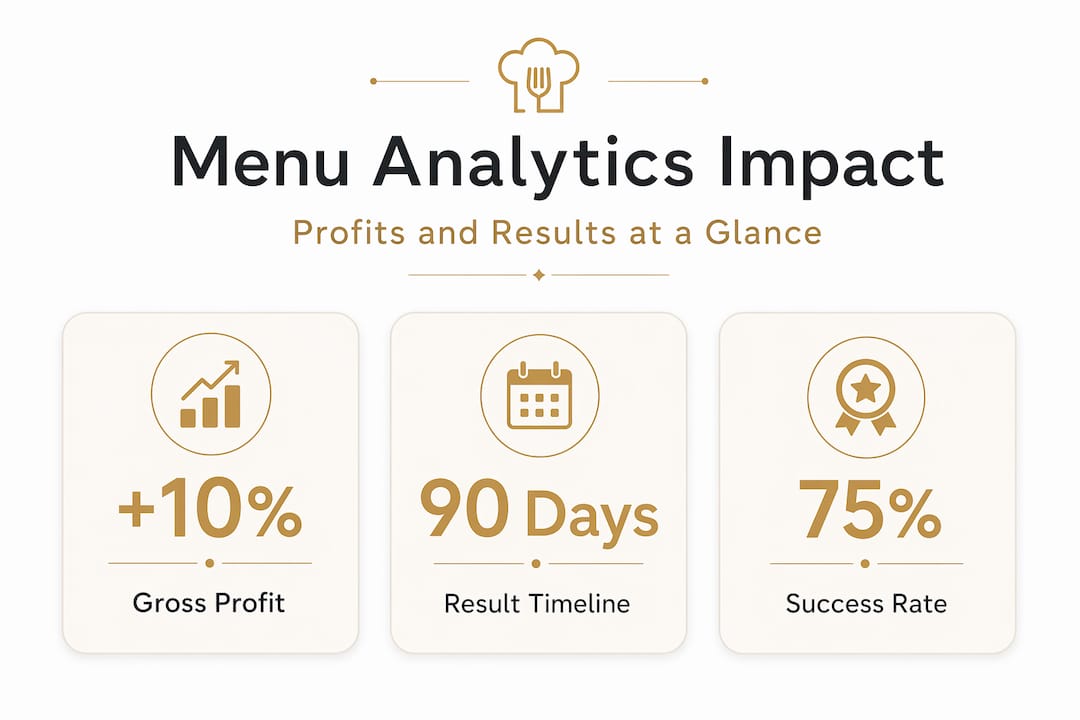
A structured menu engineering program typically delivers a 10% to 23% increase in gross profit within 90 days, with an average lift of 12% to 18% on the first pass. Those are not theoretical numbers. They reflect what happens when operators stop relying on instinct and start making decisions backed by data.
Metric | Benchmark | What it signals |
Gross profit lift (90 days) | 10% to 23% | Overall menu optimization impact |
Analysis time (automated) | 1.5 to 2 hours/month | Operational efficiency of analytics process |
QR scan rate | 5% to 15% of covers | Digital menu adoption by guests |
Conversion rate | 2% to 10% | Effectiveness of menu in driving orders |
The most dangerous trap in menu performance analysis is not acting too fast. It is acting too slowly.
“The highest ROI comes from a 90-day iterative cycle. Operators who wait for perfect data end up with no data that matters.”
Analysis paralysis is the most common pitfall, and automated tools are the most reliable antidote. When your system generates classification reports automatically, you spend your time deciding and implementing, not compiling spreadsheets. Other pitfalls to watch for include ignoring low-performing items because they feel like “classics,” failing to update pricing when food costs rise, and running analytics only once a year instead of on a rolling cycle.
The future of menu analytics
The most exciting shift in restaurant menu insights right now is the move from periodic reviews to continuous optimization. Static menu updates, the kind that happen once a year when the printer contract renews, are giving way to real-time data-driven adjustments that respond to what guests are actually doing today.
Here is what that evolution looks like in practice:
Real-time availability updates: When an ingredient runs low, the digital menu automatically flags or hides affected items, reducing the friction of 86’d dishes and guest disappointment.
Dynamic pricing signals: Operators can test price adjustments on specific items and measure the conversion impact within days rather than months.
Cross-location analytics: Multi-unit operators identify margin variations of over 5 percentage points across locations that static analysis would never surface, enabling centralized decisions that lift performance chain-wide.
Integrated supply chain workflows: When menu data connects directly to ordering systems, purchasing decisions become proactive rather than reactive. You buy what your best-performing items actually need, not what last month’s habit suggested.
The operators who will lead the next decade of restaurant profitability are the ones building these integrated systems now. Digitalizing restaurant operations is no longer a technology project. It is a competitive strategy.
My honest take on menu analytics
I’ve spent years watching talented restaurant operators work incredibly hard and still leave significant profit on the table. Not because they lacked skill or passion, but because they were making menu decisions based on memory and feeling rather than data. The gap between what they thought was selling and what was actually driving margin was often startling.
What I’ve learned is that the biggest barrier to menu analytics is not the technology. It’s the mindset. Many operators treat a menu update as a creative project, something you do when you’re bored with the current look or when a supplier pushes a new ingredient. In reality, menu analytics and engineering is a management discipline, as rigorous and repeatable as financial reporting.
The operators I’ve seen get the most out of this process share one habit: they act on the data quickly. They don’t wait for a perfect analysis. They pull the numbers, make a call, run the updated menu for 90 days, and measure what changed. That cycle, repeated consistently, compounds into real and lasting profit improvement.
My advice? Start with your top 20 items. Classify them. Make one change to your lowest-performing high-margin item. Measure it. That single step will teach you more about your menu than years of gut-feel decisions ever could.
— Abhi
See your menu data work for you
If you’ve been managing your menu by instinct, the good news is that switching to a data-driven approach doesn’t require a complete overhaul. It requires the right platform.
Mydigimenu is built precisely for this. The platform integrates QR code-based digital menus with real-time performance tracking, giving you the scan rates, item view data, and conversion metrics that make menu performance analysis genuinely useful. You can update pricing, reposition items, and refresh descriptions instantly, without reprinting a single page. Whether you operate one location or fifty, Mydigimenu turns your digital menu into a data engine that works as hard as your kitchen does. Explore how the platform can transform your menu from a static list into a living, profit-generating tool.
FAQ
What is menu analytics in simple terms?
Menu analytics is the process of measuring how each menu item performs based on its profitability and how often guests order it, then using that data to make smarter pricing, placement, and product decisions.
How is menu analytics different from menu engineering?
Menu engineering is the structured methodology within menu analytics that classifies items into four quadrants: Stars, Plowhorses, Puzzles, and Dogs. Menu analytics is the broader practice of collecting, interpreting, and acting on all menu performance data.
What metrics should I track for menu performance analysis?
The most important metrics are contribution margin per item, order frequency, food cost percentage, QR scan rate (5% to 15% is healthy), and conversion rate (2% to 10% for digital menus).
How often should I run a menu analysis?
A 90-day iterative cycle produces the best results. Reviewing performance quarterly lets you act on meaningful data without falling into analysis paralysis, and it gives each menu change enough time to generate reliable results.
Can small restaurants benefit from menu analytics?
Absolutely. Even a single-location restaurant with 30 menu items can see a 10% to 23% gross profit lift within 90 days by applying basic quadrant classification and making targeted changes to pricing and placement.
Recommended
Comments