
Mobile Menu Workflow for Restaurants: 2026 Guide
- Abhi Bose
- May 27
- 9 min read

TL;DR:
Optimizing mobile menu workflows enhances guest engagement, increases sales, and streamlines service.
Effective workflows require professional photos, visible navigation, technological integration, and ongoing updates.
A guest sits down, scans a QR code, and within seconds abandons the menu because the categories are buried three taps deep. That moment costs you a sale, and it happens hundreds of times a week in dining establishments where the mobile menu workflow was built as an afterthought. A well-designed mobile menu workflow is the invisible engine behind faster service, higher average checks, and guests who actually enjoy browsing. This guide gives hospitality professionals the exact process to design, launch, and continuously improve that engine.
Table of Contents
Key takeaways
Point | Details |
Workflow beats design alone | Optimizing the operational workflow behind your mobile menu drives more revenue than visual polish alone. |
Photo-first is non-negotiable | Every menu item needs a professional photo before launch. Missing images reduce conversions by up to 50%. |
Visible navigation wins | Visible navigation patterns produce 80% more engagement than hamburger menus hidden behind icons. |
Treat menus as living tools | Update your menu monthly based on guest behavior data to protect engagement and sales. |
Integration makes it coherent | QR ordering only succeeds when POS and kitchen workflows are fully connected to the ordering system. |
Prerequisites for a strong mobile menu workflow
Before you touch a single menu category or upload a photo, you need the right foundation in place. Skipping this stage is how most digital menu rollouts go sideways, not because the platform failed, but because the venue was not ready for it.
Technology you need on day one
Three tools form the backbone of any effective workflow for mobile menus. First, a digital menu platform that supports QR code delivery, real-time updates, and modifier customization. Second, a food photography system, either a professional shoot or an AI-enhanced photography service, that produces consistent, mouthwatering images across every item. Third, a reliable QR code generation and placement system that integrates with your ordering and payment flow.
Pro Tip: Do not choose a platform that requires a third-party app download. Guests abandon app-based menus at dramatically higher rates than browser-based ones.
Mobile navigation design basics that matter
The physical behavior of a guest holding a phone matters more than most operators realize. Most people browse with one thumb, which means your primary navigation elements need to live in the lower third of the screen. Bottom tab bars for primary destinations and a hamburger menu only for secondary items represents the most usability-tested pattern available.
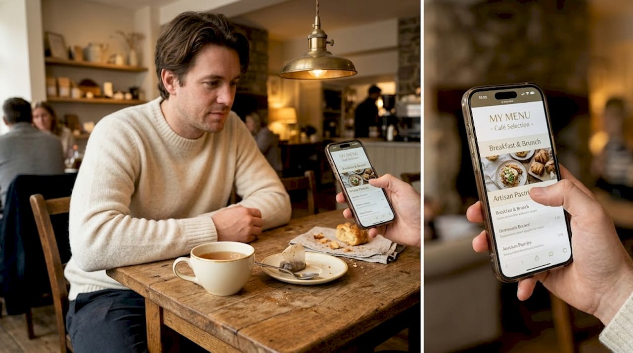
Tap targets are another detail that separates a good experience from a frustrating one. Minimum tap target size is 44x44 pixels on both iOS and Android. Go smaller and guests will mis-tap, scroll past items, or close the menu entirely.
Content and team readiness
Preparation Area | What to Confirm Before Launch |
Photography | Professional photos for 100% of menu items |
Menu copy | Descriptions written, dietary tags applied |
Staff training | Team briefed on how to assist guests with QR menus |
Platform access | Admin login, categories, and pricing ready to publish |
Integration check | POS and payment systems connected and tested |
Your front-of-house staff will be your first line of support once the menu goes live. A brief ten-minute orientation covering how guests access the menu, what to do if a QR code is not scanning, and how to handle special requests digitally prevents the most common service disruptions.
Step-by-step execution of the workflow
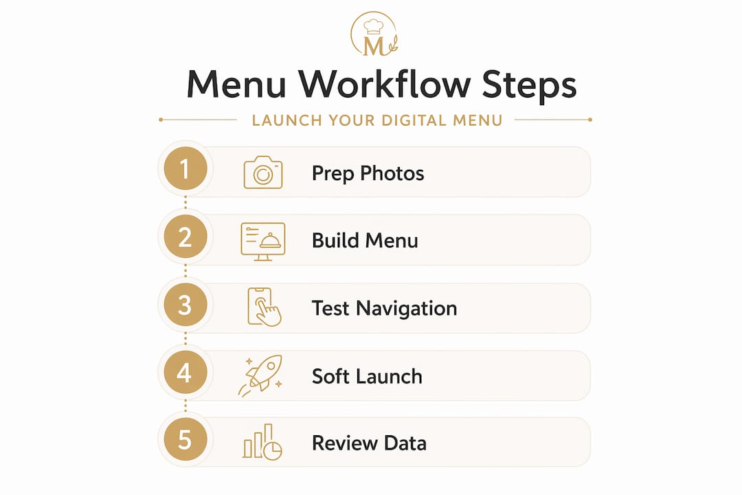
Once your prerequisites are in order, the actual mobile menu launch process takes roughly three days from photography to live deployment. Here is the sequence that produces reliable results.
The full workflow, step by step
Photograph and enhance every menu item. Dedicate one to two days to a full photo shoot. Use AI enhancement tools to standardize lighting, color balance, and crop consistency across the entire catalog. Every item needs its own image before you proceed.
Build your platform structure. Set up your main categories, subcategories, and individual items. Add modifiers, allergen tags, pricing, and dietary information for each item. This is painstaking work, but it is the foundation everything else sits on.
Apply your navigation design. Configure your visible bottom tab bar for the highest-traffic categories, such as mains, drinks, and specials. Move secondary content like house policies or allergen guides behind a secondary menu or expandable section.
Place high-margin items strategically. Visual carousels at the top of the menu with modifiers hidden behind a single tap is a well-proven pattern for encouraging higher average checks without overwhelming guests with choices upfront.
Test the full cart and checkout flow. Walk through the entire experience as a guest would. Add items, apply modifiers, proceed to payment, and confirm the order reaches your POS and kitchen correctly. Fix any errors before a single QR code goes live.
Deploy QR codes throughout the venue. Place codes at every table, on tent cards, at the bar, near the entrance, and on any surface where a guest might naturally pause. Each code should link directly to the active menu.
Brief your team and go live. Communicate the launch to your staff, confirm everyone understands their role, and publish the menu.
Pro Tip: Run a soft launch with just one section of your venue for 24 hours before a full rollout. Real guests surface issues that internal testing never catches.
Workflow Phase | Typical Duration | Key Output |
Photography and AI enhancement | 1 to 2 days | Full image library |
Platform build and content entry | 1 day | Published menu draft |
Testing and QA | 1 day | Error-free checkout flow |
QR deployment and staff briefing | Half day | Live, operational menu |
The best practices for mobile navigation tell us that combining discoverability with thumb-friendly access is not a luxury. It is the minimum standard guests now expect from any dining experience worth their time.
Troubleshooting common workflow mistakes
Even well-planned digital menu rollouts develop friction points. Knowing where most operators stumble lets you catch problems before they damage guest experience.
The most costly mistakes, and how to avoid them
Overusing the hamburger menu. Hiding all navigation behind a three-line icon feels clean at first glance, but it destroys discoverability. Visible navigation consistently outperforms hidden patterns by significant margins. Reserve the hamburger for overflow content only.
Undersized tap targets. A button that looks large on a desktop design preview can shrink to an unusable size on a 5-inch phone screen. Always test on actual devices, not just browser simulators.
Launching without complete photo coverage. Guests skip menu items that have no images. Items without photos are nearly invisible to mobile guests and can reduce conversions by up to 50%. There is no workaround for this. Every item needs an image, full stop.
Cognitive overload from flat menus. Showing sixty items in one unbroken list causes decision paralysis. Progressive disclosure, presenting category overviews first and revealing item details on tap, keeps guests oriented and moving toward a decision.
Skipping end-to-end checkout testing. Order flow errors discovered by guests are far more damaging than errors discovered internally. Test the full path from item selection to kitchen ticket on multiple devices and operating systems before launch.
The menu is not done when it is published. It is done when guests are ordering confidently and the kitchen is receiving accurate tickets. Everything before that is just preparation.
Maintaining a regular audit rhythm matters as much as the initial launch. Digital menus function as living tools that require monthly updates based on real guest behavior. Swap underperforming photos, reposition items that are being skipped, and refresh seasonal descriptions. A menu left untouched for six months is already losing ground.
You can explore restaurant menu design principles that translate directly into better engagement and fewer workflow breakdowns.
Measuring success and ongoing optimization
Launching is not the finish line. Optimizing mobile menu performance is an ongoing discipline, and the operators who treat it that way consistently outperform those who set it and forget it.
Key metrics worth tracking
Guest engagement rate. What percentage of QR code scans result in an order? A high scan rate with low order conversion points to navigation friction or photo gaps.
Average order value. If AOV is flat after launch, your placement of high-margin items and modifiers may need reconfiguration.
Cart abandonment rate. Guests who build a cart and leave without ordering indicate a checkout problem. This could be a payment option issue, a confusing confirmation screen, or a loading speed problem.
Item view-to-order ratio. Items with high views but low orders are either priced incorrectly or have weak photos and descriptions.
Building a review routine that actually happens
Weekly data reviews do not need to be lengthy. A fifteen-minute look at the metrics above, paired with a standing monthly menu update session, is enough to identify and act on the most impactful opportunities. The goal is to turn behavior data into specific changes, not to generate reports that no one reads.
Pro Tip: Every time you update the menu, send a brief message to your front-of-house team explaining what changed and why. This keeps staff aligned and prevents them from giving guests contradictory information.
Platforms that boost restaurant efficiency with digital tools typically include built-in analytics dashboards that surface these metrics automatically. The difference between operators who improve over time and those who plateau is almost always whether they are actually using that data.
For a deeper look at iterating your menu layout based on real guest traffic patterns, the guide on menu optimization for engagement covers the process in practical detail.
My honest take on mobile menu workflows
I’ve watched dozens of hospitality teams invest real money in beautiful digital menus and then watch those menus underperform from day one. The most common reason is that they built a digital copy of their paper menu rather than rethinking the experience for a touchscreen.
A paper menu relies on the physical act of flipping pages and a server’s ability to guide choices. A mobile menu has neither of those advantages. What it does have is the ability to surface the right item to the right guest at the right moment through smart categorization, visual hierarchy, and behavioral data. Most operators never get close to using those capabilities because they treat the menu as a static asset rather than a dynamic product.
In my experience, the most successful mobile menu workflows I’ve seen share one trait: the operator views the menu as something they are constantly testing and improving, not something they built once. Monthly photo swaps, quarterly navigation reviews, and regular checkout testing are what separate menus that grow revenue from menus that merely replace paper.
I’ve also seen the theory of “keep it simple” taken too far. A menu stripped so bare that guests cannot find their favorite item is not simple. It is frustrating. The balance lies in progressive disclosure, giving guests a clear path to what they want without drowning them in options before they are ready.
Stay adaptable. The tools will keep improving. The venues that win will be the ones still paying attention six months after launch.
— Abhi
Transform your menu with Mydigimenu
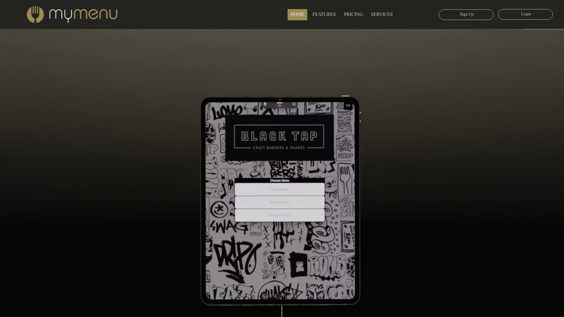
Mydigimenu is built specifically for hospitality venues that want to turn their mobile menu workflow into a genuine revenue driver. The platform supports QR code menus that require no app download, full tablet and iPad menu experiences, AI-enhanced food photography integration, multilingual support, and real-time menu updates that take seconds to publish. Setup is fast, the interface is intuitive for non-technical teams, and the built-in analytics give operators the behavior data they need to keep improving.
Whether you are launching your first digital tablet menu or replacing a clunky QR system that never quite worked, Mydigimenu has a plan that fits. You can also generate a fully functional QR code menu and get your venue live within a day. Review the available pricing and plans to find the right fit for your operation.
FAQ
What is a mobile menu workflow?
A mobile menu workflow is the end-to-end process of building, deploying, and managing a digital menu that guests access on their phones, covering everything from photography and platform setup to navigation design, checkout testing, and ongoing updates.
How long does it take to launch a mobile menu?
A complete interactive menu launch typically takes about three days, with one to two days for food photography and AI enhancement, one day for platform setup, and one day for testing and QR code deployment.
Why do some mobile menus fail to convert?
The most common causes are missing food photos, which cut conversions by up to 50%, hidden navigation that reduces engagement, and checkout flows that were never tested end-to-end on real guest devices.
How often should a restaurant update its mobile menu?
Operators should treat digital menus as living tools and update them monthly by analyzing guest behavior data, refreshing underperforming photos, and adjusting item placement based on order patterns.
What navigation pattern works best for mobile restaurant menus?
A bottom tab bar for primary categories combined with a secondary hamburger menu for less-visited content delivers the highest usability and engagement for mobile dining experiences.
Recommended
Comments