
Five Menu Performance Metrics Restaurants Use, Backed by Digital Tests

Five numbers drive every profitable menu: food cost percentage, unit contribution margin, sales mix, average check, and RevPASH. Track these first, and treat digital-menu engagement (item opens, add-to-cart rate) as an early-warning layer once the fundamentals are in place. The immediate move is simple: pull one month of segmented POS and recipe-cost data, then run a single controlled change against it before touching anything else on the menu.
TL;DR:
Monitoring food cost percentage, contribution margin, sales mix, average check, and RevPASH provides the foundation for profitable menu management.
Integrating POS, recipe costing, and digital engagement data helps identify actual item profitability and visitor behavior patterns more accurately.
Conducting controlled, one-variable tests over a six- to eight-week period ensures accurate measurement of menu change impacts.
Digital menus enable passive tracking of item interest, which supplements sales data and highlights friction points in the ordering process.
Regular, small-scale reviews and quick operational tweaks often outperform infrequent, large menu overhauls in maintaining optimal profitability.
Table of Contents
What Are the Core Menu Performance Metrics?
Every dish on your menu tells a financial story, but only if you know how to read the numbers behind it. The five metrics below form the backbone of any serious menu engineering effort, and each one answers a different question about how a dish earns (or costs) you money.
Food cost percentage answers “how much of this dish’s price goes straight to ingredients?” The formula is:
Food Cost % = (Cost of Ingredients ÷ Selling Price) × 100
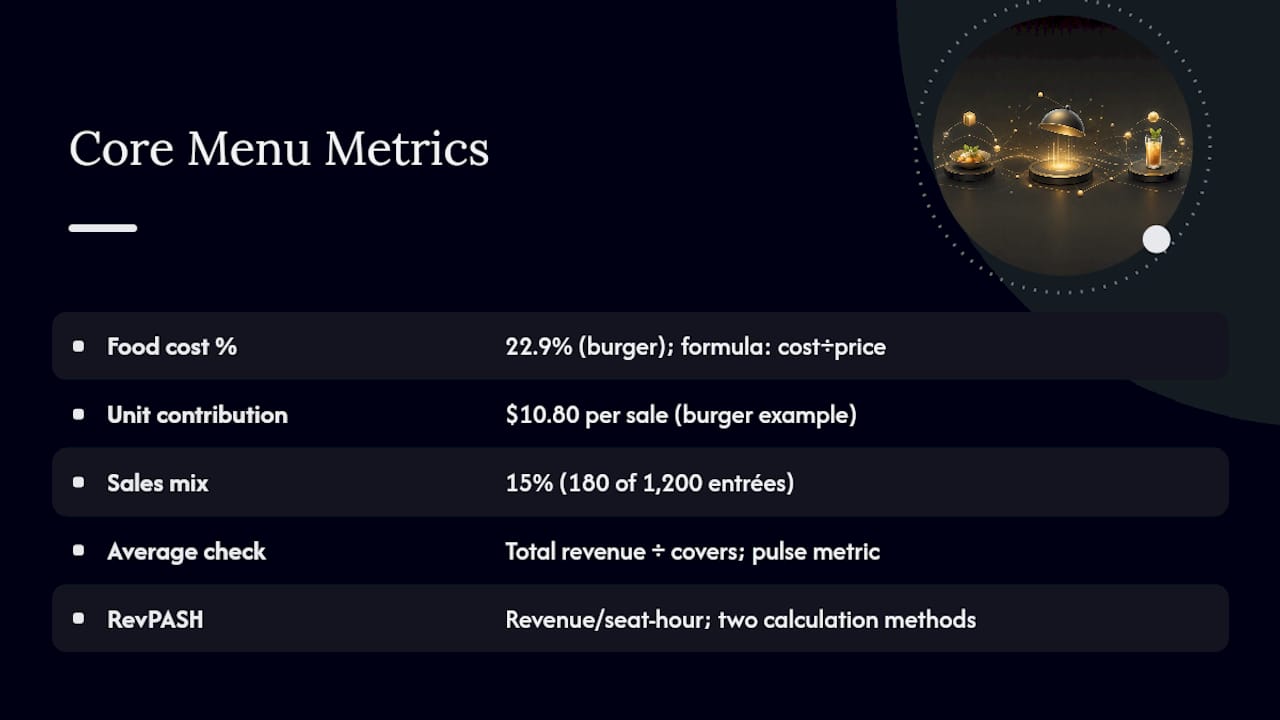
A burger that costs $3.20 to plate and sells for $14 runs a food cost of about 22.9%. Most full-service restaurants aim for a range between 28% and 35%, though the right target depends heavily on your concept. A steakhouse will run higher on protein-heavy plates and make it up on beverage margins; a pizza place can run leaner across the board.
Unit contribution margin matters more than food cost percentage for most pricing decisions, because it measures actual dollars, not a ratio. The formula:
Unit Contribution Margin = Selling Price − Food Cost
That same $14 burger with a $3.20 food cost throws off $10.80 in contribution margin per sale. Multiply by volume and you get total contribution margin, the number that actually pays your rent and payroll. A dish with a high food cost percentage but strong volume and a healthy per-unit margin can outperform a “lean” dish that barely sells.
Sales mix, sometimes called popularity share, tracks what percentage of total item sales each dish represents. If you sold 1,200 entrées last month and 180 of them were the burger, that dish holds a 15% sales mix. Menu engineering research from Cornell treats popularity as one of two primary axes for evaluating items, alongside contribution margin, because a brilliant margin on a dish nobody orders does nothing for your bottom line.
Average check is total revenue divided by number of covers (or checks, depending on how you want to slice it). It is the simplest of the five metrics, but it moves constantly with upsell success, portion changes, and menu layout, which makes it a useful pulse check between deeper reviews.
RevPASH, or revenue per available seat-hour, ties revenue to your physical capacity rather than just to transactions. Cornell’s revenue management research outlines two valid ways to calculate it: revenue divided by seat-hours available, or average check per person multiplied by seat occupancy, divided by meal duration. Choose whichever method matches the data you already track reliably.
Menu metrics only mean something when they come from data that talks to each other. Restaurant365’s analysis makes the point bluntly: many operators lack visibility into which items make or lose money because food cost, sales, and recipe data live in separate systems that never sync. Integrating your POS with recipe costing software is what turns these five formulas from an accounting exercise into a working management tool.
Operational Costs That Quietly Erode Menu Profitability
The five headline metrics tell you what’s happening at the surface. The operational metrics below explain why, and they’re where most of the profit leakage actually occurs.
Cost of goods sold (CoGS) aggregates every dollar spent on food and beverage inventory during a period. It moves for reasons that have nothing to do with your menu design: a supplier price hike, a seasonal produce swing, or a shift in your protein mix. Watching CoGS trend against revenue, rather than in isolation, tells you whether rising costs are a pricing problem or a purchasing problem.
Prime cost combines CoGS with total labor cost, and it’s the single number most operators should watch weekly. A menu with a dozen slow-braised items and made-to-order sauces might look great on paper for food cost percentage while quietly bleeding labor hours that never show up until prime cost is calculated. Complexity has a labor tax, and it rarely gets attributed to the dish that caused it.
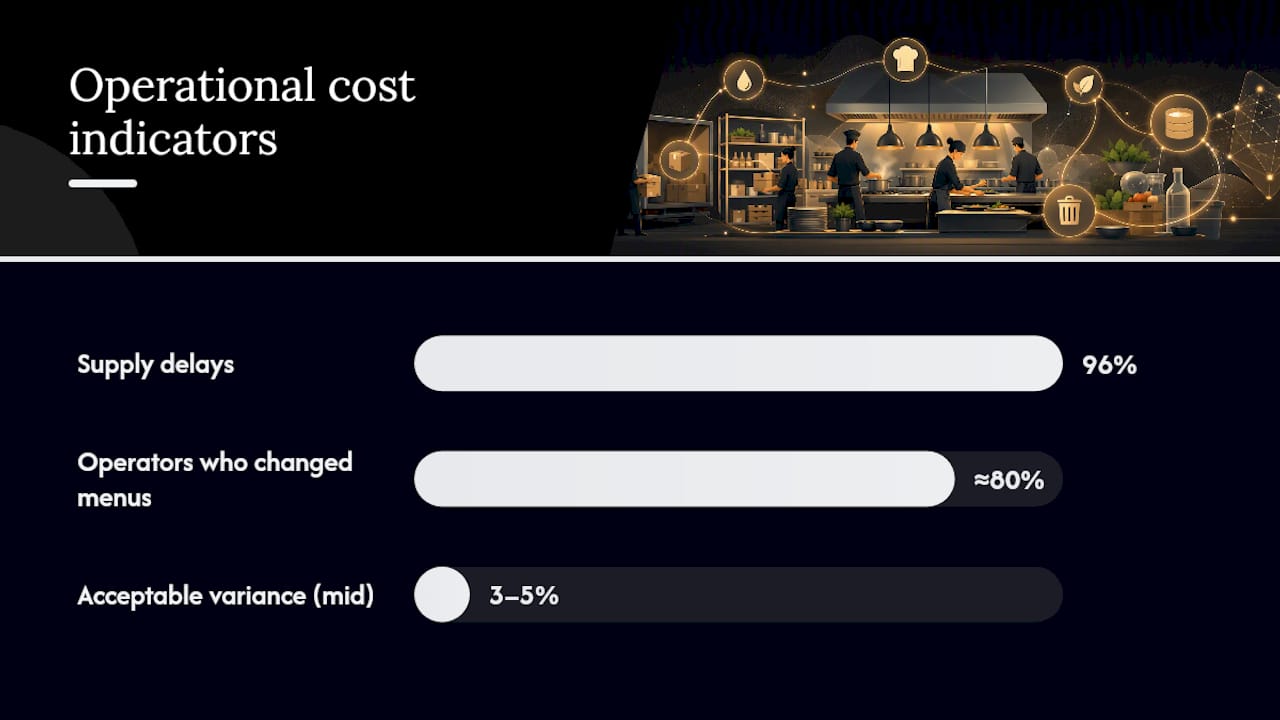
Inventory turnover measures how many times you cycle through your stock in a given period. Slow turnover on a specific ingredient usually points to overordering, a menu item that’s underperforming, or a slow-moving special that should have been cut weeks ago. The National Restaurant Association’s research found that during recent cost pressures, 96% of operators experienced supply delays and roughly 8 in 10 full-service operators changed their menus in response, largely by trimming item counts and cross-utilizing ingredients across dishes.
Theoretical versus actual cost is the gap between what your recipes say a dish should cost and what your inventory draws actually show. This gap is where portion-control problems, employee waste, over-pouring, and theft hide.
To surface a portion-variance problem, compare theoretical usage against actual depletion for your top five ingredients by cost, then investigate any variance over roughly 3 to 5%:
Pull weekly inventory counts against POS-recorded sales for each core ingredient.
Flag items where actual usage consistently exceeds theoretical usage by more than a few percentage points.
Spot-check portioning during a live shift for the flagged dish, not just on paper.
Retrain or re-standardize the recipe card if the gap traces back to inconsistent execution rather than theft or waste.
Re-measure after two weeks to confirm the fix held.
Ignoring this gap is expensive in a way that rarely shows up on a single day’s numbers. It compounds, ingredient by ingredient, invisibly, until a quarterly review reveals margins that don’t match what the menu should be delivering.
How to Run a Menu Engineering Analysis
The menu engineering matrix, developed by Kasavana and Smith, remains the fastest way to turn a spreadsheet of dish-level data into a decision. It plots every item on two axes: contribution margin on one side and popularity (sales mix) on the other. Where an item lands determine what you do next.
To calculate placement, you need each item’s unit contribution margin and its share of total sales, then compare both against your menu-wide averages. Items above average on both axes and items below average on both axes sort into the four familiar quadrants:
Stars (high margin, high popularity): These are your best-performing dishes, and the instinct to leave them alone is usually right. Feature them prominently on the menu, protect their quality consistently, and resist discounting them just because they already sell well.
Cash cows (low margin, high popularity): Guests love these dishes, but they’re not paying you enough for the privilege. Look for small price increases guests won’t notice, or shave cost through portion or ingredient adjustments that don’t damage the eating experience.
Puzzles (high margin, low popularity): The profit is there, but nobody’s ordering. Reposition the item higher on the menu, rewrite the description to be more appetizing, add a photo or video if your platform supports it, or have staff suggest it directly.
Dogs (low margin, low popularity): These items are quietly costing you shelf space, ingredient inventory, and prep time. Cut them, unless they serve a strategic purpose like rounding out a vegetarian or gluten-free section.
The MDPI 2025 study on menu performance analysis found that combining Kasavana and Smith’s original matrix with complementary variants from Miller and Pavesic surfaces corrective measures a single matrix can miss, particularly around borderline items that sit close to your averages on both axes.
Before making any change, decide whether the fix belongs in pricing, description, portion size, or placement. A Puzzle with genuinely strong margins rarely needs a price cut. It needs better visibility. A Cash Cow rarely needs to be cut from the menu. It needs a few cents added to the price or a slightly smaller portion.
Pro Tip: Before you touch pricing on a Cash Cow, check whether it shares a core ingredient with a Star or a Puzzle. Cross-utilizing that ingredient across two or three dishes often lowers your effective food cost on all of them without a single price change, and it’s the exact tactic operators leaned on hardest during recent supply disruptions.
Operational constraints matter as much as the math. A Star that requires a slow-cooked protein and ties up your only sous-vide unit during peak hours might need a production-schedule fix, not a menu fix. Run the matrix monthly or at each menu-change cycle. Cornell’s revenue management research notes that frequent, smaller reviews consistently outperform infrequent, sweeping overhauls, because they catch drift before it compounds.
Digital-Menu Engagement Metrics Worth Tracking
Sales figures tell you what guests ordered. Engagement metrics tell you what guests almost ordered, and that distinction is where digital menus earn their keep as a diagnostic tool rather than just an ordering interface.
The leading indicators worth watching:
Item opens: how often a guest taps into a dish’s detail view.
Time on item: how long they linger once there, a rough proxy for interest or hesitation.
Add-to-cart rate: the percentage of item opens that convert to an actual cart addition.
Impressions-to-order ratio: how many guests saw the item on the menu screen versus how many ordered it.
Video view rate: for items with video content, how many guests watch it and for how long.
A 2023 study in the Journal of Hospitality & Tourism Technology found that video-based digital menu content generated stronger behavioral purchase intentions than static formats, though the effect size depends heavily on venue type and cuisine. A separate 2024 peer-reviewed survey found that visual appeal and informativeness strongly predict purchase intention, with a reported effect of β=0.655. Treat both findings as a hypothesis to test in your own dining room, not a guarantee.
Designing a valid test means changing one variable at a time. If you add a video to a Puzzle item, hold its price, placement, and description constant during the test window, or you won’t know which change drove the result. The same logic applies to menu layout tweaks: moving an item to a different section and rewriting its description in the same week muddies your data.
Interpreting the results takes discipline. A spike in item opens with no corresponding lift in orders usually means the description or price is losing guests after they’ve shown interest, not that the placement failed. A rise in add-to-cart rate with flat total contribution margin might mean guests are trading down from a higher-margin item to reach this one. Engagement metrics are a leading signal. They tell you where to look; they don’t replace the lagging financial numbers that tell you what actually happened.
Setting a Baseline and Running Controlled Menu Tests
Guessing whether a menu change worked is the single most common mistake operators make, and it’s entirely avoidable. Cornell’s revenue management guidance lays out a specific, repeatable procedure, and it starts before you change anything at all.
Build a baseline first. Pull at least one month of detailed POS data, segmented by day of week and hour of day. A Tuesday lunch pattern and a Saturday dinner pattern behave differently enough that averaging them together will hide real signals.
Record full change metadata. Every time you touch a menu item, log the date, the ordering channel (in-house versus third-party delivery), the price, its placement on the menu, the exact description text, and its availability window. Skipping this step is why so many “we tried that and it didn’t work” conclusions turn out to be wrong.
Implement one change at a time against that documented baseline, whether it’s a price adjustment, a new description, or an added video.
Run the test for six to eight weeks minimum, then re-evaluate. Cornell’s own guidance recommends re-checking results after roughly two months, long enough for novelty effects to fade and for the change to reflect real ordering behavior rather than a first-week curiosity bump.
Track leading and lagging indicators together throughout the window: seat occupancy, average check, RevPASH, party mix, and meal duration on the lagging side; item opens and engagement on the leading side.
Skipping the baseline step is the fastest way to draw the wrong conclusion from a right decision. A price increase that coincides with a slow month will look like a failure even when it’s working exactly as intended, and only a proper baseline lets you separate the two.
A Weekly and Monthly Cadence for Menu Metrics
Metrics only drive decisions when someone actually looks at them on a schedule. Without a cadence, even the best dashboard becomes background noise.
Weekly tasks:
Spot-check your top five sellers for any sudden shift in sales mix.
Review food cost percentage against the prior week for early warning signs of a supplier price change.
Flag any inventory anomaly, unusually fast depletion, unusually slow turnover, before it becomes a monthly surprise.
Monthly tasks:
Run the full menu-engineering matrix across every active item.
Conduct an item-level contribution margin review, comparing this month against a rolling three-month average.
Reassess any item currently mid-test against its documented baseline.
Assign clear ownership. One person (often a general manager or kitchen manager) should own the raw data pull. A second person, sometimes the owner, sometimes a chef with P&L visibility, should own the actual menu decisions that come out of the review. Whoever runs experiments should be the same person logging change metadata, so nothing gets lost between the test and the analysis.
Pro Tip: If you’re short on time, start with the fastest wins: consolidate ingredients that appear in only one dish, simplify prep steps on your lowest-margin Cash Cows, and give your Stars better placement before you touch pricing on anything. These three moves cost nothing to implement and usually show up in the numbers within a single review cycle.
Quick wins matter because momentum matters. A team that sees a measurable result from a small change, an ingredient consolidation that trims 2% off food cost, say, is far more likely to stick with the discipline of measuring the next change too.
How Digital Menu Platforms Capture the Data You Need
A paper menu can’t tell you that a guest opened the seared scallops three times before ordering the chicken instead. That single data point, an item open with no conversion, is exactly the kind of friction signal that a digital menu analytics platform captures automatically and a laminated menu never will.
A QR-code or tablet menu system reliably logs item opens, time spent on a dish’s detail view, add-to-cart events, video watch time, and impressions-to-order ratios, the exact leading indicators described in the engagement section above. None of that requires a server to remember to ask, or a guest to fill out a survey. It happens passively, every time a menu is browsed.
The integration piece is where the real payoff shows up. When a digital menu platform connects to your POS and recipe costing system, the theoretical-versus-actual cost gap gets easier to close, because portion data, sales data, and engagement data all live in one place instead of three disconnected systems. That’s the exact fragmentation problem Restaurant365’s research points to as the reason so many operators fly blind on item-level profitability.
Mydigimenu was built around that integration gap. The platform’s QR and tablet menu tools capture engagement signals directly, and its POS integrations feed that data into the same reporting layer as your sales and recipe costs. High-quality food videos and customizable layouts give you the raw material to actually run the presentation tests described earlier in this article, rather than just guessing at what a better photo might do.
Once that data is flowing, it slots directly into the monthly menu-engineering cycle. Instead of waiting for a quarterly POS export, you’re watching Puzzles gain visibility in near real time and confirming whether a repositioned Cash Cow actually moved the needle within the same review window.
Benchmarking Your Menu Metrics Against Industry Standards
Raw numbers mean little without a comparison point.
Build your benchmark from two directions at once. Second, and more valuably, benchmark against your own trailing 12-month average for the same metric. Seasonal ingredients, local competition, and your own menu complexity all shift what “normal” looks like for your specific restaurant.
Competitor data is harder to access directly, but industry trend reports fill part of the gap. The National Restaurant Association’s research on pandemic-era menu trends shows that a large share of full-service operators cut menu item counts and cross-utilized ingredients in response to cost pressure, a useful signal if your own menu has grown more complex than your kitchen can efficiently support.
The healthiest use of benchmarking isn’t chasing an industry average. It’s noticing when your own trend line diverges from where it’s been, then asking why before the gap widens further.
Why Menu Design and Layout Change the Numbers
Where a dish sits on the page changes how often it sells, independent of anything about the dish itself. Eye-tracking research on printed and digital menus consistently shows that guests scan in predictable patterns, and items placed in high-visibility zones get more attention regardless of their actual quality or price.
This is exactly why a Puzzle item, strong margin, weak sales, often responds better to a layout change than a price cut. Moving it into a featured position, pairing it with a description that emphasizes flavor and provenance rather than just listing ingredients, or adding a photo can lift its sales mix without touching contribution margin at all.
Digital menus add a variable print menus can’t offer: the layout itself can be tested and adjusted without reprinting anything, highlighting the role of online food ordering for restaurants and customers. A menu design change that takes a print shop two weeks to execute takes minutes on a digital platform, which means you can run the kind of controlled tests described earlier in this article far more cheaply and far more often.
The caveat: don’t change layout and pricing in the same test window. If both move at once, you’ll have no way to attribute the result to either variable, and you’ll be back to guessing.
Turning Guest Feedback Into Menu Decisions
Numbers tell you what happened. Guest feedback often tells you why, and it’s the layer most operators skip until a review problem becomes public.
Direct feedback collected through a digital menu or post-visit prompt tends to surface issues faster than review sites do, because it captures sentiment while the meal is still fresh and before a frustrated guest decides a public review is the only way to be heard. If a Puzzle item keeps drawing comments about portion size or seasoning, that’s a signal worth weighing alongside the sales-mix data, even when the contribution margin looks fine on paper.
Public reviews serve a different function: they reveal patterns across a larger sample and over a longer time horizon. A recurring complaint about a specific dish across a few months of reviews is worth cross-referencing against that item’s engagement metrics. Frequent item opens paired with recurring negative feedback on portion or quality often point to a description-versus-reality mismatch, not a pricing problem.
Treat feedback as a qualifier on your quantitative data, not a replacement for it. A dish with strong contribution margin and positive feedback is a genuine Star. A dish with strong contribution margin and consistent complaints is a Star with a shelf life, and it’s worth fixing the underlying issue before it drags down its own numbers.
Measurement Discipline Beats Clever Menu Hacks
The biggest mistake I see operators make isn’t picking the wrong metric. It’s chasing a clever tactic, a trendy description rewrite, a psychological pricing trick, before they’ve established what their baseline even looks like. A restaurant that moves its top seller to a new position without a documented baseline will never know if the resulting sales bump came from the move or from a warm week of good weather.
The prioritization that actually works is boring, and that’s the point: measure first, simplify operations second, get creative with promotions third. A kitchen running six near-duplicate sauces because nobody ever cross-referenced recipes against sales mix will get more out of consolidating those sauces than out of any menu redesign. Only once the fundamentals are stable does a genuinely creative promotion have a clean baseline to prove itself against.
— Abhi
Getting the Data Without Building It Yourself
Every metric in this article depends on data that a lot of restaurants simply don’t have flowing in one place. Mydigimenu solves that specific problem: it’s a single platform that captures item-level engagement signals through QR and tablet menus, connects to your POS for sales data, and gives you the presentation tools, videos, customizable layouts, targeted campaigns, to actually run the controlled tests described above.
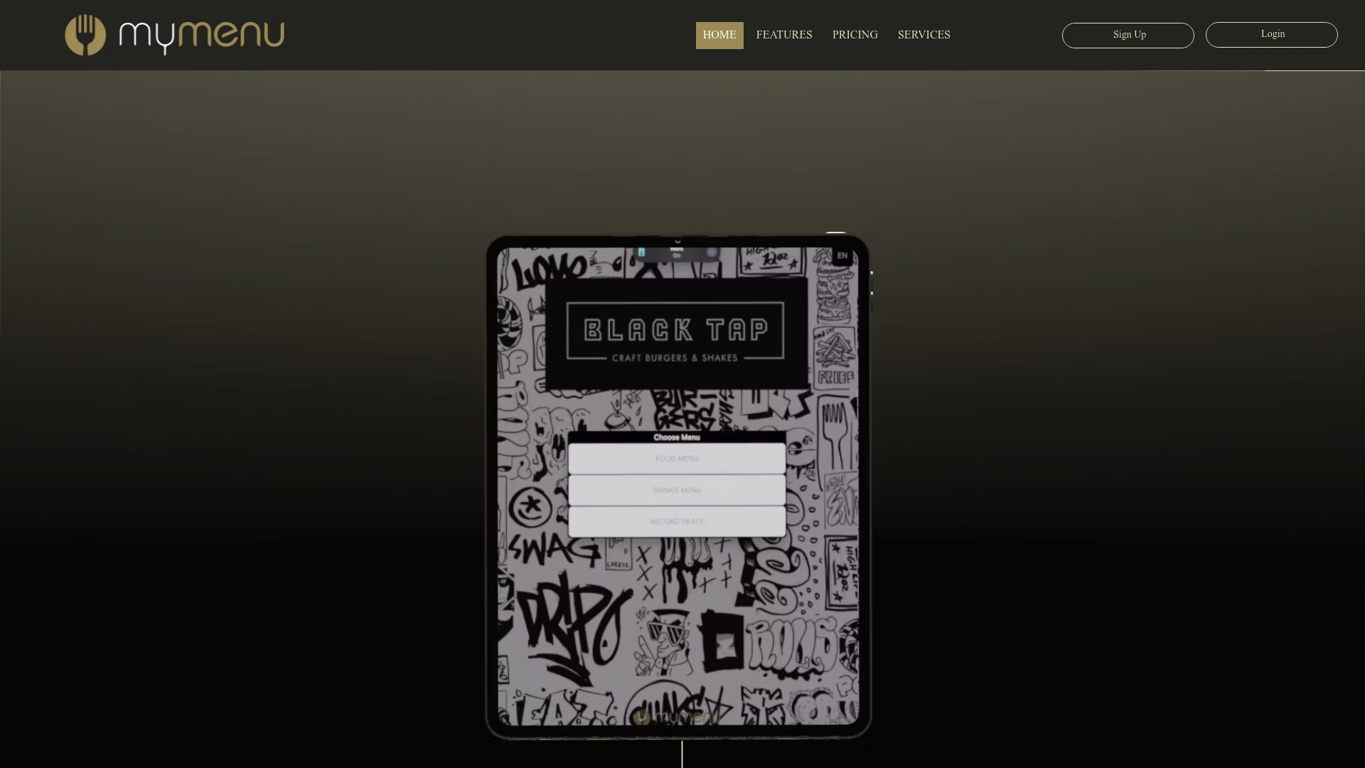
Rather than exporting spreadsheets from three disconnected systems, you get item opens, add-to-cart activity, and video engagement sitting next to your sales mix and contribution margin in one view. That’s the integration gap that keeps so many operators flying blind on which dishes genuinely earn their place on the menu. If seat turnover and RevPASH are part of your priority list, the Restaurant Reservations Module adds table-management data to the same picture.
Plans start with the StartUp Menu at $39 per month, scaling up through Silver, Gold, Platinum, and beyond depending on how much campaign and CRM functionality you need. Check the pricing page to compare plans and find the tier that matches your current menu-engineering workload.
Sources
FAQ
What is the 30/30/30/10 rule for restaurants?
It’s a starting benchmark rather than a fixed target, since actual splits vary by concept, region, and service style.
What are the key performance metrics for restaurants?
The core set includes food cost percentage, contribution margin, sales mix, average check, and RevPASH, alongside operational metrics like prime cost and inventory turnover. Digital-menu platforms like Mydigimenu add a leading-indicator layer, item opens, add-to-cart rate, and video engagement, that surfaces problems before they show up in sales data.
What are the seven P’s of marketing for restaurants?
The seven P’s, adapted from general marketing theory, typically cover product, price, place, promotion, people, process, and physical evidence, applied to how a restaurant designs its offering and guest experience. Menu-specific metrics like sales mix and contribution margin most directly inform the product and price components of that framework.
What are the three C’s in a restaurant?
Definitions vary across the industry, but a commonly cited version refers to concept, cost, and consistency as the three pillars that determine whether a restaurant’s menu performs over time. Consistency in particular ties directly to the theoretical-versus-actual cost gap covered earlier in this article.
How often should I re-evaluate a menu change?
Cornell’s revenue management guidance recommends establishing a baseline from at least one month of POS data, then re-evaluating results after roughly six to eight weeks of the change running, giving novelty effects time to fade. Smaller, monthly reviews tend to catch problems earlier than infrequent, large-scale menu overhauls.
Recommended
Comments