
Restaurants: Menu A/B Tests in Minutes With QR Menu Workflows


Yes, you should A/B test your website menu whenever discoverability or conversion from navigation matters to your bottom line. Start by choosing one primary metric, whether that’s menu interaction rate, click-to-order, or reservation conversion, and pre-calculate your sample size before launch. Your next move is simple: pick the first change worth testing, whether it’s visibility, label wording, or a CTA, and instrument the events that will tell you if it worked.
TL;DR:
Visible and hybrid navigation menus significantly increase link usage and reduce time to find key options compared to hidden hamburger menus.
Testing label wording, category order, and CTA phrasing offers high-impact, low-effort opportunities to improve discoverability and conversion rates quickly.
Pre-calculating sample size and focusing on a single, clear metric ensures trustworthy results and avoids false positives in menu A/B tests.
Content-based menu adjustments via digital platforms can be implemented in minutes, allowing faster iterations without involving developers.
Consistent documentation and monitoring of tests build team knowledge and prevent repeated mistakes over time.
Table of Contents
Why A/B testing menus matters
Navigation feels like a small design detail until you watch what happens when it fails. The Nielsen Norman Group’s desktop navigation research found that hidden navigation, the collapsed hamburger icon many sites used to declutter desktop layouts often reduces how often people find and use menu links, and slows down the ones who do. Visible or combination navigation, where primary links stay on screen and secondary ones tuck behind a labeled control, tends to perform better.
That single design choice cascades. A guest who can’t find “Reservations” or “Order Online” within a few seconds doesn’t hunt for it. They leave, or they call instead, which adds friction and cost to a transaction that should have taken one tap. A restaurant’s website menu isn’t decoration: it’s the first checkpoint between curiosity and a completed order or booking.
Hidden navigation on desktop sites showed substantially lower use and slower navigation times compared with visible menus, a gap worth closing before you spend budget on other page elements.
This is also why menu experiments often outrank other UX tests on a roadmap. Pricing pages, product copy, and checkout flows matter, but they only get traffic if people can navigate to them in the first place. A navigation fix touches every page downstream of it, which gives menu tests disproportionate leverage relative to their build cost. If your analytics show high bounce rates on category or landing pages, or support tickets mentioning “I couldn’t find,” your menu is probably the bottleneck, not the content behind it.
What to test in menus: prioritized experiments you can run today
Not every menu test deserves equal priority. Some changes are cheap to build and carry a high chance of moving a metric; others take longer to implement and resolve smaller uncertainties. Here’s where to start.
Visibility tests: compare a fully visible top navigation against a hidden hamburger menu, or a hybrid that keeps two or three priority links exposed while tucking the rest away.
Label and content tests: swap vague labels (“Explore”) for specific ones (“Menu,” “Reservations”) to improve information scent, the cues that tell a visitor what they’ll find before they click.
Structure tests: reorder categories, group related items, or surface local navigation (like dietary filters or meal-time sections) that’s currently buried two clicks deep.
CTA and microcopy experiments: test “Order” against “Order Now, No Fee” or “Reserve a Table” against “Book Now” to see which wording moves more clicks into completed actions.
Visual and accessibility tests: check contrast ratios, font size, sticky menu behavior on scroll, and tappable area size on mobile, since a menu that’s technically visible but hard to tap still underperforms.
Pro Tip: Run a tree test before building any visual variation when you suspect the real problem is labeling or category structure rather than placement. It’s faster and cheaper than shipping a live A/B test that fails for reasons you could have caught with a $0 study.
Prioritize by expected impact and effort. A label swap takes an afternoon; a full navigation restructure touches templates across the site. Start with the cheap, high-signal tests and save structural overhauls for when you have data pointing clearly in one direction.
Designing the experiment: hypothesis, OEC, and metrics for menu tests
A menu test without a written hypothesis is just a design change with extra steps. The Stanford controlled experiments guide treats a clear hypothesis and a single Overall Evaluation Criterion (OEC) as the foundation of any trustworthy online experiment, and that discipline applies directly to navigation.
State the hypothesis precisely: “Changing the CTA from ‘Order’ to ‘Order Now, No Fee’ (treatment) versus the current label (control) will increase click-to-order rate, because it removes a cost objection before the click.”
Choose one primary metric (your OEC): pick the single number that defines success, such as menu interaction rate, click-to-order rate, reservation conversion, or revenue per session. Resist the urge to track five “important” metrics as co-equal winners.
Add secondary metrics and guardrails: watch bounce rate, average task time, and accessibility failures (like tap targets below recommended size) to catch harm the OEC might miss.
Confirm the OEC ties to a business outcome: a menu interaction rate that doesn’t eventually connect to orders, bookings, or revenue isn’t worth optimizing in isolation.
Choosing one OEC does more than simplify reporting. It aligns designers, marketers, and engineers around the same definition of success, so a test that lifts clicks but tanks revenue per session doesn’t get called a win by one team and a loss by another. Our own restaurant menu design guide covers how layout choices interact with these same conversion metrics, useful context once you’re deciding which variant to prioritize first.
Sample size, statistical power, and avoiding common pitfalls
Before you launch anything, calculate how many visitors you need to detect a real effect. Four inputs drive that number: your baseline conversion rate, the minimum detectable effect (MDE) you care about, your confidence level, and your desired statistical power. The Stanford guide recommends pre-calculating all four before a single visitor sees a variant, rather than running until results “feel” significant, a habit that inflates false positives.
Desired statistical power in most online experiments sits around 80 to 95 percent, meaning you accept a small chance of missing a real effect in exchange for a manageable sample size.

Evan Miller’s sample-size calculator is the practical tool most practitioners reach for: plug in your baseline rate and the MDE you want to detect, and it returns the minimum visitors per variant you need before checking results. If your current click-to-order rate is 4% and you want to detect a move to 5%, the calculator tells you exactly how many sessions that requires at your chosen confidence level, instead of guessing.
A few habits separate trustworthy tests from noisy ones:
Run an A/A test first on unfamiliar infrastructure to confirm your randomization and tracking aren’t introducing bias on their own.
Avoid peeking at results daily and stopping the moment a variant looks ahead. Early leads frequently regress once the sample catches up.
Change one variable at a time. Testing a new label and a new CTA color simultaneously makes it impossible to know which one moved the needle.
Double-check that your OEC is actually the metric you meant to optimize, not a proxy that’s easy to measure but loosely connected to revenue.
Tools and setup: implementation approaches and integrations
How you implement a menu test shapes how much you can trust the result. Three broad approaches exist: client-side testing (JavaScript swaps content after the page loads, fast to set up but prone to flicker), server-side testing (the server decides which variant to render before anything reaches the browser, more reliable for navigation-level changes), and CMS-native experimentation (built into some website platforms, convenient but sometimes limited in what it can vary).
For a digital menu specifically, a few integrations make results worth trusting:
Analytics event tracking on every menu interaction, click, scroll depth to the menu, and completed order or reservation, not just pageviews.
Session recordings or heatmaps to see why a variant won or lost, since the numbers alone rarely explain visitor behavior.
Data export to a warehouse or BigQuery when you need to segment results by device, location, or returning versus new visitors. Firebase’s A/B testing documentation outlines this workflow for teams already using its console.
Feature flags or content variants for low-effort tests, letting you toggle a label or CTA for a percentage of traffic without a full redeploy.
QR-targeted variants, useful for hospitality menus where a table-side QR code can point to a different layout than the main website for comparison.
Before trusting any result, run a short QA pass: confirm the randomization split actually matches what you configured, check that a returning visitor keeps seeing the same variant instead of flipping between them, and verify every event you’re measuring fires correctly in both variants. A test built on broken instrumentation produces a confident, wrong answer.
Running, monitoring, analyzing, and rolling out menu tests
Launch day isn’t the finish line, it’s the start of the part that actually determines whether your test means anything.
QA before launch: confirm randomized assignment is working, both variants render correctly across devices, and your OEC event fires reliably before you send real traffic.
Monitor guardrails while the test runs: watch for anything breaking, like a spike in bounce rate or a drop in page load speed, that would make continuing the test harmful regardless of the OEC trend.
Interpret results on both axes: statistical significance tells you an effect is probably real; practical significance tells you whether it’s big enough to matter. A confidence interval that includes both “slightly worse” and “meaningfully better” means you need more data, not a decision.
Roll out deliberately: when a variant wins clearly, ship it to full traffic, then keep watching the OEC for a week to confirm the lift holds outside the test environment.
Document every test, win, loss, or inconclusive, in a shared results repository: the hypothesis, the sample size, the outcome, and what you’d try next. This habit, recommended broadly in experimentation practice, builds institutional memory so your team stops re-running tests it already answered six months earlier.
Menu testing best-practices checklist
Keep this list on hand when planning or reviewing any menu experiment.
Do isolate a single variable per test so you know exactly what caused the result.
Do pick one OEC tied to a business outcome and pre-calculate sample size before launch.
Do keep critical links visible on desktop rather than defaulting to a hidden hamburger menu when screen space allows it.
Do check accessibility and mobile tap targets as part of every variant, not as an afterthought.
Don’t change labels, structure, and visuals all at once; you’ll learn nothing about which change worked.
Don’t skip a tree test when the real question is about labeling or category structure rather than visual design.
Pro Tip: Keep a one-page template for every test, hypothesis, OEC, sample size, and result, so reviewing six months of experiments takes minutes instead of a full afternoon of digging through old dashboards.
Practical perspective: how digital-menu platforms speed menu experiments
Running a menu test on a typical website means coordinating a developer, a QA pass, and a deployment window for every variant. A digital menu platform changes that math. Because the menu itself lives in a content system rather than hardcoded templates, swapping a label, reordering categories, or testing a new CTA often takes minutes instead of a sprint.

Consider a mid-size restaurant testing whether a visible “Reserve a Table” button on the main QR menu outperforms a version where reservations sit inside a secondary tab. With content variants and QR-based deployment, that comparison can run across different table groups or shifts without touching any app store listing, since no app download is required on either side. The metrics worth tracking are the same ones covered above: click-to-order rate, reservation conversion, and menu interaction rate, segmented by lunch versus dinner traffic if volume allows it.
This kind of fast iteration matters most for smaller hospitality teams without a dedicated engineering resource, who can especially benefit from understanding the role of online food ordering in improving operations. The constraint on testing is rarely the idea, it’s the time between deciding to test something and actually seeing it live in front of real guests.
How Mydigimenu can help you run menu A/B tests faster
Testing a menu change shouldn’t require a developer sprint every time you want to try a new label or CTA. Our platform lets you build content variants, QR menus, and tablet menus directly, so a reordered category or a reworded “Reserve a Table” button goes live in minutes rather than weeks.
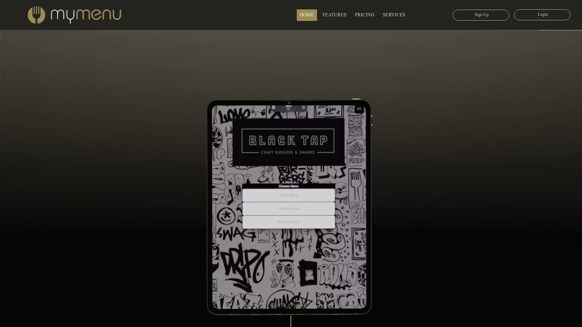
That speed compounds with the analytics integrations covered earlier: every click, scroll, and completed order feeds back into the same dashboard, so you’re measuring the OEC you chose, not guessing from anecdotal feedback. Plans start at StartUp Menu for $39 per month, with QR deployment and tablet ordering available as you scale testing across locations. If reservation conversion is part of your OEC, the Restaurant Reservations Module adds table management built for exactly that metric.
Check our pricing plans to see which tier fits the pace of testing you want to run.
FAQ
What is SEO A/B testing?
SEO A/B testing compares two versions of a page element, like a title tag, heading, or navigation label, to see which drives better organic engagement or click-through from search. For menus specifically, this often means testing label wording or structure to see which version search visitors navigate more successfully once they land.
Does A/B testing really work?
A/B testing works reliably when it’s built on a properly calculated sample size, a single clear OEC, and one variable changed at a time, as outlined in the Stanford controlled experiments guide. It fails to deliver trustworthy answers when teams peek early, change multiple elements at once, or stop testing before reaching adequate sample size.
What are examples of A/B testing for menus?
Common menu examples include visible versus hidden navigation, label wording changes like “Menu” versus “Explore,” CTA phrasing such as “Order Now” versus “Order Now, No Fee,” and structural tests like reordering categories or exposing a reservations link that was previously buried. Each targets a specific hypothesis about discoverability or conversion.
How do you do A/B testing on a website menu?
Start by writing a hypothesis naming your control, your treatment, and the expected direction of change, then choose one primary metric as your OEC. Calculate the minimum sample size using a tool like Evan Miller’s calculator, launch the test with proper randomization, and avoid judging results until you reach that pre-calculated sample size.
Sources
Author’s closing perspective and recommended next steps
If you’re starting from zero, pick the single highest-value test you can run this month: making your primary CTA more visually salient, or exposing a critical link that’s currently hidden behind a hamburger icon. Don’t try to fix everything at once. Write down your hypothesis, run it long enough to hit your calculated sample size, and document the result, win, loss, or inconclusive, somewhere your whole team can find it later.
The habit of documenting matters more than any single test’s outcome. Six months of recorded learnings beats six months of gut-feel redesigns every time.
— Abhi
Recommended
I enjoyed reading these punjabi shayari sad expressions because they capture the quieter side of sadness and memories. The words are simple, but the thoughts behind them can feel quite deep. Punjabi poetry has a natural ability to make emotional experiences sound personal and sincere. I liked the reflective tone of the lines because it encourages readers to think about their own feelings. This is meaningful content for anyone who enjoys emotional Punjabi poetry.