
How to Showcase Menu Items for Maximum Sales Impact

TL;DR:
Effective menu showcasing uses strategic item selection, prime placement, and professional photography to boost sales and guest satisfaction. A hybrid of physical and digital menus with consistent visuals and operational standards sustains credibility and captures customer attention. Proper placement, image quality, and regular menu reviews are essential for maintaining the impact of your menu design over time.
Showcasing menu items effectively is defined as the strategic use of visual hierarchy, placement psychology, and high-quality imagery to direct guest attention toward your most profitable and popular dishes. Done right, it functions as choice architecture, steering ordering decisions through design rather than pressure. The industry term for this discipline is menu engineering, and every restaurant professional who wants to grow check averages needs to master it. Tools like Piktochart’s menu design framework, the golden triangle principle, and schema.org structured data markup each play a distinct role in how to showcase menu items across both print and digital formats.
How to identify hero menu items worth showcasing
The first step in any showcasing strategy is deciding which dishes deserve the spotlight. Menu engineering divides your offerings into four categories: Stars (high popularity, high margin), Plowhorses (high popularity, low margin), Puzzles (low popularity, high margin), and Dogs (low popularity, low margin). Your hero items are your Stars, and occasionally your Puzzles when you want to shift ordering behavior toward a more profitable dish.
The practical rule is to limit hero items to 1 to 3 featured photos and no more than 3 to 5 promoted items per menu section. That constraint matters because the moment you highlight everything, you highlight nothing. A guest scanning a menu covered in badges, boxes, and photos experiences visual noise, not guidance.
Here is a clear process for selecting your hero items:
Pull your sales mix data. Identify your top 20% of dishes by order volume over the past 90 days.
Cross-reference with food cost. Calculate gross margin per dish. A dish ordered frequently but with a 70% food cost is not a hero candidate.
Identify your Puzzles. Find dishes with strong margins but low order counts. These are prime candidates for showcasing to shift behavior.
Limit your selection. Choose 1 to 3 items per menu section to feature. Resist the urge to promote more.
Review seasonally. Hero items should rotate with ingredient availability and guest trends, not stay fixed year-round.
Pro Tip: Use your menu engineering data to identify one Puzzle dish per section and give it a hero photo or badge. Shifting even 10% of orders toward that dish can meaningfully improve your weekly margin.
What are the best visual placement strategies for menu items?
Placement is where menu showcasing becomes genuinely scientific. The golden triangle principle identifies three zones on a physical or digital menu where guest gaze concentrates most heavily: the top-right, the center, and the bottom-left. Research shows that approximately 35% of reading time focuses on the top-right zone, and items placed in these prime positions receive up to three times more orders than items buried in lower-attention areas. That is not a small lift. It means placement alone can outperform a price discount.
Beyond the golden triangle, visual isolation techniques signal importance without shouting. Subtle boxes, shaded backgrounds, or recommendation icons should be used sparingly, applied to no more than one or two items per category. Overuse collapses the effect entirely.
Key visual and placement strategies that work in practice:
Prime zone placement. Put your highest-margin Star dishes in the top-right and center positions of each menu section.
Typography contrast. Use a slightly larger or bolder font for hero item names only. Apply this to two items maximum per page.
Color accents. A single accent color for a badge or border draws the eye. Using three or four colors creates chaos.
Whitespace. Surround hero items with more breathing room than surrounding items. Whitespace signals premium status without a single word.
Price formatting. Removing currency symbols in prime menu zones reduces price scrutiny and keeps attention on the dish, not the cost.
Pro Tip: When redesigning a physical menu, print a draft and photograph it from arm’s length. The items that catch your eye first in that photo are the ones your guests will notice. If your hero items are not in that group, reposition them before going to print.
Here is a quick comparison of placement techniques by format:
Technique | Physical menu | Digital menu |
Golden triangle zones | Fixed by layout design | Configurable per screen size |
Visual badges | Printed icons or stamps | Dynamic, updatable in real time |
Whitespace control | Set at design stage | Adjustable per device |
Currency symbol removal | Applied at print | Editable without reprinting |
How to photograph menu items that actually drive orders
Photos drive 44% more orders when done well, but low-quality, blurry images actively damage guest perception. That single data point reframes the photography decision entirely. A mediocre photo is worse than no photo at all. The goal is not to document every dish. The goal is to make two or three dishes look so mouthwatering that guests feel compelled to order them.
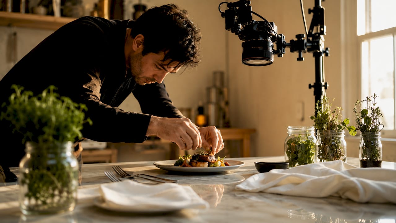
For hero photography, the technical standard that maximizes sensory appeal is a 45-degree overhead angle with warm-colored backgrounds shot at 150 DPI resolution. That angle reveals texture, layers, and color simultaneously, which is why it dominates professional food photography. Flat overhead shots flatten depth. Eye-level shots hide toppings. The 45-degree angle is the sweet spot.
Practical photography guidelines for restaurant teams:
Hire a food stylist for hero shots. Even a half-day session with a professional stylist and photographer produces images that outperform months of smartphone attempts.
Use natural or warm artificial light. Harsh overhead kitchen lighting creates unflattering shadows. A simple reflector and a window can transform a shot.
Keep backgrounds neutral and consistent. A consistent visual style across all menu photos signals professionalism. Mixing rustic wood boards with clinical white plates creates visual confusion.
Limit photos to signature dishes. Photographing every item dilutes the impact of each image and creates menu clutter that slows ordering decisions.
For fine dining, consider illustrations. Hand-drawn icons or watercolor illustrations can convey elegance more effectively than photography in upscale environments.
Pro Tip: Shoot your hero dish photos on the same day you finalize plating standards with your kitchen team. The photo and the plate that arrives at the table must match. Any gap between the two erodes guest trust faster than a bad review.
Consistency across your visual library matters as much as individual image quality. When a guest flips through a menu and sees three photos with different lighting styles, backgrounds, and color temperatures, the menu feels assembled rather than designed. That perception transfers to the food itself.
Digital vs. physical menus: which format showcases items better?
Physical menus build a tactile brand experience that digital formats cannot fully replicate. The weight of a leather-bound menu, the texture of thick card stock, the typography choices: all of these communicate brand positioning before a guest reads a single word. Physical menus also eliminate the distraction of notifications and loading times.
Digital menus, however, offer capabilities that print simply cannot match. Features like collapsible categories, filters, and responsive design let guests navigate large menus without cognitive overload. Specials can be updated in minutes rather than reprinted at cost. Multilingual support opens your menu to international guests without producing separate printed versions. And for search discoverability, schema.org JSON-LD markup on digital menus allows search engines to index individual menu items, prices, and descriptions, turning your menu into a searchable asset rather than a static document.
The most effective approach for most restaurants in 2026 is a hybrid model. Premium physical menus handle the core dining experience and brand storytelling. A digital layer, delivered via QR code or tablet, handles daily specials, wine lists, allergen filters, and promotional content. This split lets each format do what it does best.
Format | Strengths | Limitations |
Physical menu | Brand tactility, no tech dependency | Costly to update, no multimedia |
Digital QR menu | Real-time updates, multimedia, multilingual | Requires device and connectivity |
Tablet menu | Rich visuals, interactive filters | Hardware cost, maintenance |
Hybrid model | Best of both formats | Requires coordination to keep consistent |
For digital menus specifically, mobile optimization is non-negotiable. A well-designed digital menu should load in under three seconds, display hero images without horizontal scrolling, and allow guests to filter by dietary preference with a single tap. These are not luxury features. They are baseline expectations for guests in 2026.
Key takeaways
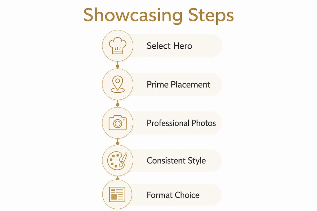
Effective menu showcasing combines strategic item selection, prime placement, professional photography, and the right format mix to drive measurable increases in order value and guest satisfaction.
Point | Details |
Select hero items carefully | Limit featured dishes to 1 to 3 per section using menu engineering data on margin and popularity. |
Apply golden triangle placement | Position highest-margin dishes in top-right, center, and bottom-left zones for up to 3x more orders. |
Invest in photography quality | A few professional hero shots outperform many mediocre images and can drive 44% more orders. |
Use visual isolation sparingly | Boxes, badges, and shading lose impact when overused. Apply to one or two items per category only. |
Combine physical and digital formats | A hybrid approach lets each format contribute its unique strengths to the overall guest experience. |
Why the gap between photo and plate is the real test of showcasing
Here is what most menu design guides skip entirely: showcasing is an operational commitment, not just a design decision. I have seen restaurants invest in gorgeous hero photography, nail the golden triangle placement, and still damage guest trust within a week of launch. The reason is almost always the same. The dish that arrives at the table does not match the image on the menu.
When a guest orders based on a photo and receives something that looks noticeably different, the disappointment is disproportionate to the difference. It feels like a broken promise. That reaction is not irrational. It is the natural consequence of setting a visual expectation and failing to meet it. Consistent plating and portion control are not optional refinements. They are the operational backbone that makes showcasing credible.
My honest recommendation is to treat your hero photo shoot as a plating standardization session. Before the photographer arrives, run the dish through your kitchen team three times and document every element: portion weight, garnish placement, sauce volume, plate position. That documentation becomes your plating guide. The photo becomes the reference image pinned in the kitchen. Both exist to serve the same goal: delivering the experience the guest was sold.
The restaurants that sustain showcasing effectiveness over time are the ones that review their menus quarterly. Seasonal ingredient changes, new kitchen staff, and supplier shifts all affect what a dish looks like on the plate. A photo that was accurate six months ago may now misrepresent the dish. Scheduled reviews catch that drift before guests do.
— Abhi
How Mydigimenu helps you showcase your menu items
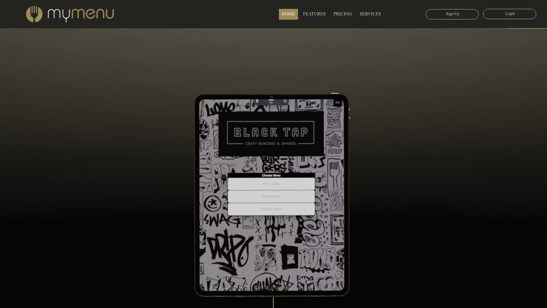
Mydigimenu is built for exactly this challenge. The platform’s tablet and iPad digital menus give you full control over hero image placement, promotional badges, and category layout, so your Stars and Puzzles always appear in prime viewing positions. Updates take minutes, not days, which means your daily specials and seasonal hero items stay current without reprinting costs.
For restaurants that want contactless access, Mydigimenu’s QR code menu generator delivers a mobile-optimized experience with rich visuals, multilingual support, and the flexibility to highlight featured items dynamically. The platform also supports schema.org markup for search discoverability, turning your digital menu into a guest acquisition tool as well as an ordering interface. If you are ready to see what a well-designed digital menu can do for your check averages, Mydigimenu is the place to start.
FAQ
How many menu items should you highlight at once?
Limit featured items to 1 to 3 hero photos and 3 to 5 promoted items per menu section. Highlighting more than that eliminates the visual contrast that makes showcasing effective.
What is the golden triangle in menu design?
The golden triangle refers to the top-right, center, and bottom-left zones of a menu where guest gaze concentrates most. Items placed in these zones receive significantly more attention and orders than items in lower-priority positions.
Do photos on menus actually increase orders?
Professional food photos drive 44% more orders for the dishes they feature. Low-quality photos, however, can reduce orders by damaging perception, so quality always outweighs quantity.
What angle works best for food photography?
A 45-degree overhead angle with warm-colored backgrounds at 150 DPI resolution produces the most appealing hero shots. This angle captures texture, depth, and color simultaneously in a way that flat overhead or eye-level shots cannot.
Should restaurants use digital or physical menus for showcasing?
A hybrid approach works best. Physical menus deliver brand tactility and a premium feel, while digital menus via QR code or tablet enable real-time updates, multimedia content, and multilingual support that print cannot provide.
Recommended
Comments