
Cafe Menu Board Design Tips That Drive Sales
- Abhi Bose
- 6 days ago
- 10 min read

TL;DR:
A well-designed cafe menu board is the most powerful sales tool, influencing customer choices before interaction. It should prioritize legibility, visual hierarchy, and strategic item placement to boost confidence and sales. Limiting colors, incorporating professional photos, and testing in real conditions further enhance its effectiveness.
A well-designed menu board is the single most powerful sales tool in your cafe. Before a customer speaks to anyone, your board is already shaping what they order, how much they spend, and whether they feel confident doing it. The best cafe menu board design tips share one common thread: they put the customer’s decision-making process first. Typography, color contrast, visual hierarchy, and strategic item placement all work together to create a board that customers can scan in seconds and act on with confidence.
1. cafe menu board design tips start with legibility
Legibility is the foundation of every effective menu board. If customers cannot read your board from the queue, nothing else matters.
The most reliable rule in the industry is the 1-inch letter height per 10 feet of viewing distance. A board mounted 20 feet from the register needs letters at least 2 inches tall. Most cafe owners underestimate this and end up with beautiful boards that customers quietly squint at.
Font choice matters just as much as size. Sans-serif typefaces like Helvetica, Futura, or Montserrat read cleanly at distance. Decorative scripts look charming on Instagram but fail in real-world lighting. Reserve script fonts for your cafe name or a single category header, never for item names or prices.
Color contrast is the third pillar of legibility. Dark text on a light background or light text on a dark background both work. The problem is mid-range contrast, like gray text on a beige board, which collapses under overhead lighting or natural glare.
Pro Tip: Stand at the back of your customer queue with your phone camera and take a photo of the board. If you need to zoom in to read anything, your font is too small.
2. how to use visual hierarchy to guide customer choices
Customers do not read menu boards like books. Eye-tracking research shows they scan in an F-pattern, moving across the top, then down the left side, with a secondary sweep across the middle. This pattern is your design blueprint.
The “golden triangle” principle builds on this. Place your highest-margin items and bestsellers in the top-right, top-left, and center zones of your board. These are the positions customers’ eyes land on first and return to most often. Items buried at the bottom-left get the least attention regardless of how good they are.
Use font weight and size to establish clear hierarchy:
Category headers: largest font, bold, high contrast
Item names: medium font, standard weight
Descriptions: smallest font, lighter weight or italics
Prices: consistent size, never larger than item names
Grouping related items under clear category headers reduces the mental work customers do. A customer scanning “Espresso Drinks” as a header can skip straight to what they want without reading every line. That speed translates directly to shorter queues and higher order confidence.
Pro Tip: Never list items alphabetically. Alphabetical order serves your filing system, not your customer’s buying flow. Organize by decision journey instead, placing popular and high-margin items at the top of each category.
3. the right color palette for effective menu presentation
Color is where many cafe owners either play it too safe or go too far. Limiting your palette to 2–4 colors maintains visual cohesion and speeds up scanning. More than four colors creates visual noise that slows customers down and dilutes your brand identity.
Your color choices should connect directly to your brand style guide. If your cafe uses warm terracotta and cream in its interior, those same tones on your menu board create a unified experience. Disconnected color schemes signal inconsistency, and customers notice even when they cannot articulate why.
Here is a practical comparison of color approaches:
Color Approach | Visual Effect | Best For |
2-color (dark + light) | Clean, fast to scan | Minimalist or specialty cafes |
3-color (brand + accent) | Warm, branded feel | Independent neighborhood cafes |
4-color with photography | Rich, appetite-stimulating | Full-service cafe menus |
5+ colors | Visual clutter, slower scanning | Not recommended |
Accent colors work best when used to highlight one or two featured items, not scattered across the board. A single warm amber box around your “Staff Favorite” creates a focal point. Twelve amber boxes create chaos.
4. how food photography increases sales on menu boards
Professional food photography on menu boards is one of the highest-return investments a cafe can make. Including 5–9 hero dish photos can increase sales by over 30%. That figure reflects a straightforward psychological truth: customers order what they can visualize.
The key word is “professional.” Blurry, poorly lit, or inconsistently styled photos do more damage than no photos at all. They signal low quality before the customer takes a single sip. Invest in a half-day shoot with a food photographer, and you will have assets that work across your physical board, your digital menu, and your social channels simultaneously.
Consistent menu photography across physical and digital channels also strengthens your brand’s perceived professionalism. A customer who sees the same beautiful latte art photo on your Instagram, your board, and your QR menu feels a coherent brand experience. That coherence builds trust.
Place photos adjacent to the items they represent, never in a decorative cluster at the edge of the board. A photo of your signature cold brew should sit directly next to “Signature Cold Brew” on the board. Proximity connects the visual cue to the purchase decision.
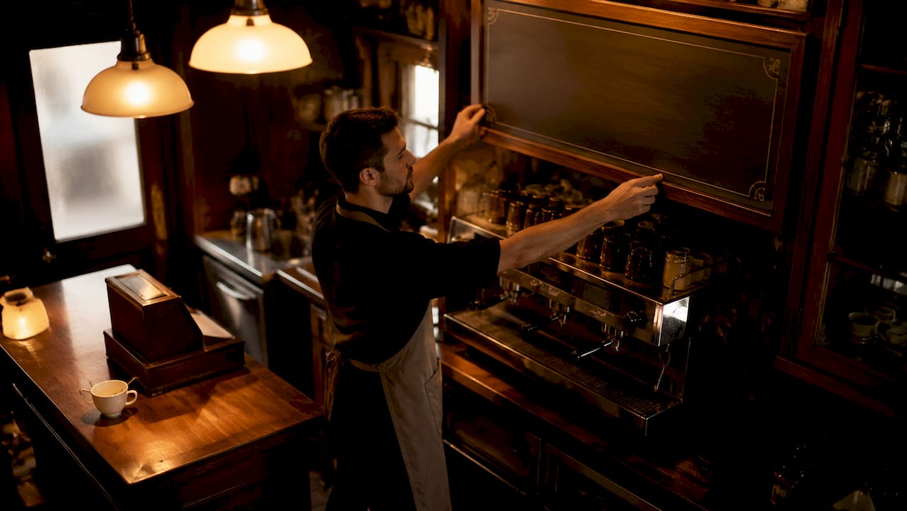
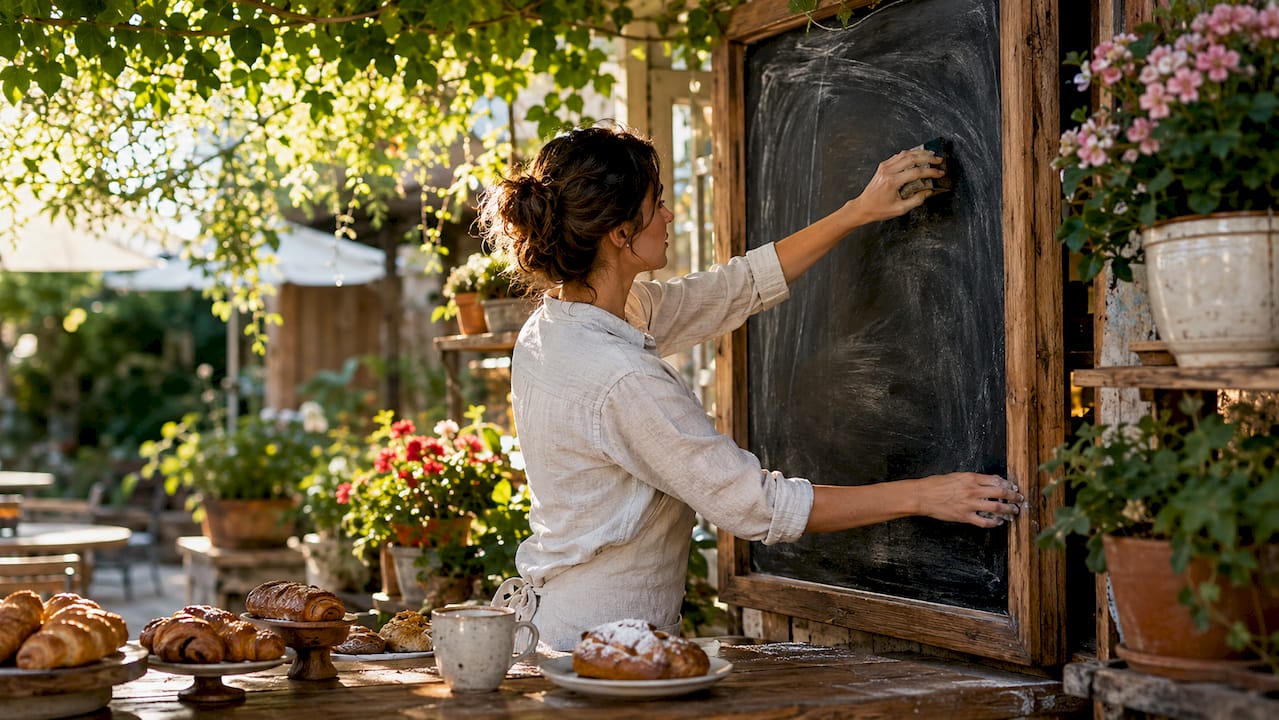
5. chalkboard vs. digital: choosing the right board type
The board type you choose shapes how much flexibility you have, what your maintenance costs look like, and how your cafe feels to customers. Each format has a distinct role.
Board Type | Best Use Case | Update Frequency | Cost Range |
Chalkboard | Specials, seasonal items, artisan cafes | Daily | Low |
Printed foam/acrylic | Core menu, stable offerings | Monthly or less | Low to medium |
Magnetic letter board | Rotating items, budget-conscious | Weekly | Low |
Digital LCD/LED | High-traffic cafes, daypart menus | Real-time | Medium to high |
Hybrid (static + digital) | Core menu + rotating specials | Mixed | Medium |
Digital boards allow real-time updates, which is a genuine operational advantage. You can switch from a morning espresso menu to an afternoon cold brew and pastry focus without touching a single piece of hardware. For cafes with high foot traffic or frequent specials, that flexibility pays for itself quickly.
Chalkboard design, done well, carries a warmth and authenticity that digital cannot replicate. Hand-lettered cafe chalkboard design tips center on consistency: use chalk markers instead of raw chalk for cleaner lines, invest in a chalk pen set with multiple nib sizes, and sketch your layout in pencil before committing.
Pro Tip: Consider a hybrid board setup. Use a static printed or chalkboard panel for your core menu and a small digital display for daily specials and seasonal drinks. You get the warmth of physical signage with the flexibility of digital.
6. whitespace is a design tool, not wasted space
Most cafe owners treat empty space on a menu board as a problem to fill. Whitespace actively reduces clutter and improves scanning speed. It is one of the most misunderstood tools in menu board layout.
Generous spacing between categories signals clear organization. It tells the customer’s eye where one section ends and another begins without requiring a heavy border or dividing line. Tight, packed boards force customers to work harder, and that friction shows up as longer decision times and more “I’ll just have a coffee” default orders.
Apply whitespace deliberately:
Leave at least one full line of space between category headers and the first item below them
Do not extend item descriptions to fill the full width of the board
Allow breathing room around featured item callouts or photo placements
The goal is a board that feels confident, not crowded. A menu board with room to breathe communicates that your cafe knows exactly what it offers and is not trying to overwhelm anyone.
7. how to test and optimize your menu board design
Design decisions made on a laptop look different in a real cafe environment. Testing legibility from the customer’s physical vantage point is the single most important validation step most owners skip.
Here is a practical testing sequence to run before finalizing any board:
Stand in the customer queue. Walk to every position a customer might occupy and read the board from there. Note anything that requires effort.
Check for sightline obstructions. Light fixtures, structural beams, and hanging plants can block sections of your board that look clear on a floor plan.
Test under real lighting conditions. Visit your cafe at opening, midday, and evening. Natural light shifts dramatically, and what reads well at noon may wash out at 8 a.m.
Time customer decisions. If you can, informally track how long customers take to order during a busy period. Long decision times often signal a layout or legibility problem.
Gather staff feedback. Your baristas hear customer confusion every day. Ask them which items customers most often ask to have explained or pointed out.
Iterate based on observation. Treat your menu board as a living asset. Adjust item placement, font sizes, or category groupings based on what you learn.
Assessing visibility during real operational hours with varying light conditions is the standard recommended by display signage professionals. A mockup approval is not a substitute for standing in your own cafe and reading your own board.
8. organizing items around the customer’s decision journey
Menu items should be organized around how customers decide, not how your kitchen operates. This distinction changes everything about your layout strategy.
A customer walks in thinking about their mood, their time, and their budget. They are not thinking about your espresso machine workflow. Structure your board to match their mental path: hot drinks first if that is your primary category, then cold drinks, then food. Within each category, lead with your most popular and most profitable items.
The 8–13 items per board panel rule exists for a reason. Exceeding 15 items per panel pushes customers toward default orders, typically the cheapest or most familiar option. Fewer, well-chosen items presented clearly generate higher average ticket sizes. This is the counterintuitive truth of menu engineering: less choice, done right, sells more.
Use menu engineering tactics like strategic item placement and visual callouts to guide customers toward your most profitable offerings without making the experience feel manipulative. The best boards feel effortless to use.
Key takeaways
Effective cafe menu board design combines legibility, visual hierarchy, and strategic item placement to increase customer confidence and average order value.
Point | Details |
Legibility comes first | Use 1-inch letter height per 10 feet of viewing distance and sans-serif fonts throughout. |
Visual hierarchy drives orders | Place high-margin items in the golden triangle zones and use font weight to signal importance. |
Limit colors and items | Stick to 2–4 colors and 8–13 items per panel to reduce visual noise and decision fatigue. |
Photography lifts sales | Five to nine professional hero photos can increase sales by over 30% when placed near featured items. |
Test in real conditions | Validate your board from the customer queue under actual lighting before finalizing any design. |
What i’ve learned about restraint in menu board design
The most common mistake I see cafe owners make is treating their menu board like a canvas for everything they love about their brand. Every font they enjoy, every color that feels warm, every item they are proud of, all of it ends up on the board at once. The result is a board that communicates enthusiasm but not clarity.
The cafes with the strongest boards I have encountered share one quality: they made hard choices. They cut items that did not earn their space. They chose one accent color and used it sparingly. They left room on the board that felt uncomfortable at first but ultimately made the whole thing easier to read.
There is also a longer-term dimension to this that does not get enough attention. Your menu board is a brand asset. The visual language you establish on that board should carry through to your packaging, your digital presence, and your social content. Cafes that treat their board as a one-off design project miss the compounding value of a consistent visual identity built over years.
The shift toward digital and hybrid boards is real and worth taking seriously. Digital signage gives you the ability to engage guests with dynamic menus in ways that static boards simply cannot match. But digital does not fix a bad layout. The same principles of hierarchy, contrast, and restraint apply whether your board is chalk on slate or pixels on an LCD screen.
— Abhi
Take your cafe menu board to the next level with Mydigimenu
Designing a great menu board is one thing. Keeping it current, consistent, and visually compelling across every customer touchpoint is another challenge entirely.
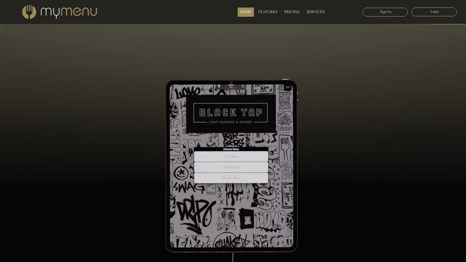
Mydigimenu makes that second part straightforward. The platform’s digital tablet and iPad menus let you update your menu in real time without reprinting a single sheet. You can integrate high-quality food photography, customize your layout to match your brand, and serve the same polished experience whether customers are ordering at the counter or scanning a QR code menu at their table. For cafes ready to combine great design with operational flexibility, explore Mydigimenu’s plans and pricing to find the right fit for your size and budget.
FAQ
What font size should a cafe menu board use?
Use the 1-inch letter height per 10 feet of viewing distance rule as your baseline. A board 15 feet from the customer queue needs letters at least 1.5 inches tall for comfortable reading.
How many items should be on a cafe menu board?
Limit each board panel to 8–13 items. Exceeding 15 items per panel increases decision fatigue and pushes customers toward default or low-margin orders.
What colors work best for a cafe menu board?
Stick to a palette of 2–4 colors that align with your brand identity. High-contrast combinations, such as dark text on a light background, deliver the fastest scanning speed and clearest legibility.
Is a digital or chalkboard menu better for a cafe?
It depends on your update frequency and aesthetic. Digital boards offer real-time flexibility for specials and daypart menus, while chalkboards deliver warmth and authenticity. A hybrid setup combining both formats captures the strengths of each.
Where should high-margin items appear on a menu board?
Place your highest-margin items in the golden triangle zones: top-left, top-right, and center of the board. Eye-tracking research confirms these are the positions customers scan first and return to most often.
Recommended
Comments