
QR Menu Design for Restaurants: A Practical Guide

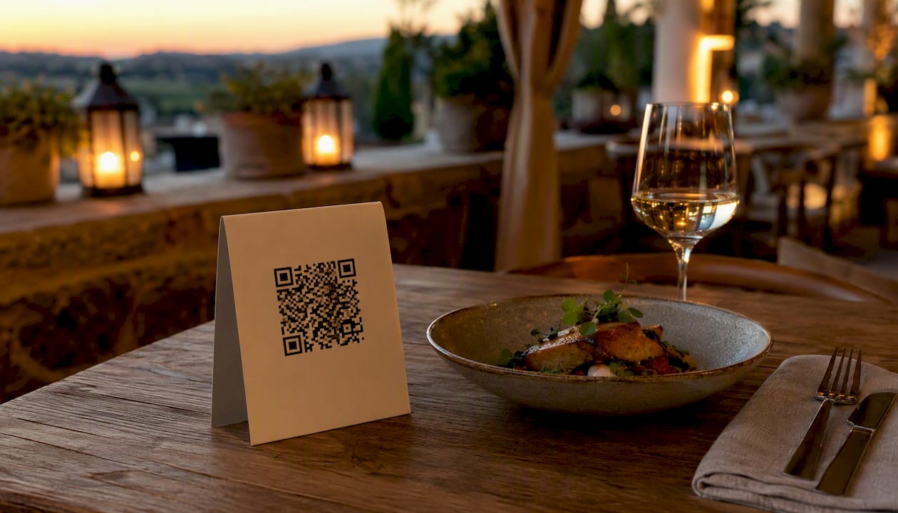
The fastest path to a restaurant-ready QR menu is a mobile-first HTML page, a dynamic QR code, and a labeled table standee on every table. That combination gives you instant updates, reliable scans, and a guest experience that feels effortless rather than clunky. Here is how to move from idea to live service in 48 hours:
Pick a menu host. A mobile HTML page loads faster and reads better on phones than a PDF. Adobe’s step-by-step workflow confirms this is the most accessible destination for a QR code.
Generate a dynamic QR code. Dynamic codes let you swap the destination URL without reprinting a single standee.
Print a labeled table tent. Add a short instruction line (“Scan to view our menu”) so guests know exactly what to do.
Run a 48-hour pilot on one dining area before rolling out to the full floor. You will catch scan failures, lighting issues, and staff questions before they become service problems.
Key Takeaways
A dynamic QR code pointing to a mobile-first HTML menu, placed on a labeled table standee, is the most reliable and updatable QR menu setup for any restaurant.
Point | Details |
Use dynamic QR codes | Dynamic codes let you update the menu destination without reprinting any table collateral. |
Mobile HTML beats PDF | A semantic HTML page loads faster, works with screen readers, and ranks better than a PDF. |
Print size and contrast matter | Print codes at a size sufficient to ensure reliable scans in low light, typically around 4cm square, on a matte surface. |
Track scans by placement | Assign unique codes per zone and use UTM tags to measure which placements drive orders. |
Mydigimenu for managed operations | Mydigimenu combines real-time editing, POS integration, analytics, and loyalty in one platform. |
Table of Contents
What is QR menu design, and how does it work at the table?
A QR code menu is a scannable square graphic that opens a digital menu on a guest’s phone, no app required. The guest points their camera at the code, taps the notification, and lands on your menu page in seconds. That is the whole flow.
The critical distinction is dynamic vs. static codes. A static QR code bakes the destination URL directly into the graphic. Change the URL and the code breaks, which means reprinting every table. A dynamic QR code stores a short redirect URL that you control from a dashboard, so you can point it at a new menu version, a seasonal page, or a different ordering flow without touching the printed code.
The destination itself matters just as much as the code type. Your three main options are a mobile HTML menu page, a PDF, and a full ordering page. Mobile HTML is the clear winner for most restaurants: it loads quickly, works with screen readers, and lets you structure content with proper headings and alt text. PDFs are fine for a quick launch but become a liability when you need to update prices or add items. An ordering page is the most powerful destination if you want guests to place and pay for orders directly from their phones.
The QR asset can live on a table tent, a window sticker, a bar topper, a receipt, or even packaging for takeout orders. Each placement is essentially a trackable entry point into your menu, which is where analytics get interesting.
Why QR menus give restaurants a real operational edge
The business case for a well-designed QR menu goes well beyond hygiene. Here is where the gains show up most clearly:
Faster table turns. Guests can browse the moment they sit down, before a server arrives. Fewer “we haven’t looked yet” delays mean tables move faster during peak hours.
Instant updates. A price change or a sold-out item takes seconds to fix on a dynamic menu. No reprints, no crossed-out items, no outdated PDFs floating around the floor.
Built-in upsell real estate. A digital menu lets you place high-margin items at the top of a category, add suggested pairings below an entrée, and surface a “most popular” badge without redesigning a printed card.
Measurable scan funnels. Dynamic codes include analytics covering scan counts, device types, and location data, so you can see which table zones drive the most menu views and which placements guests ignore.
Pair those analytics with UTM tags on your menu links and you get a clear picture of the scan-to-order conversion rate by placement, time of day, and even day of week. That kind of attribution is simply not possible with a printed menu.
Guest experience also improves in ways that are harder to quantify but easy to feel. A clean, well-designed digital menu with mouthwatering food photography and clear descriptions makes browsing feel like an adventure rather than a chore. That emotional lift tends to show up in higher check averages and better feedback scores.
Design essentials that make a QR menu actually work on a phone
Good QR menu design is not about making something look pretty on a desktop. It is about making something scannable, readable, and fast on a four-year-old Android in a dimly lit dining room.
Mobile-first layout and information architecture
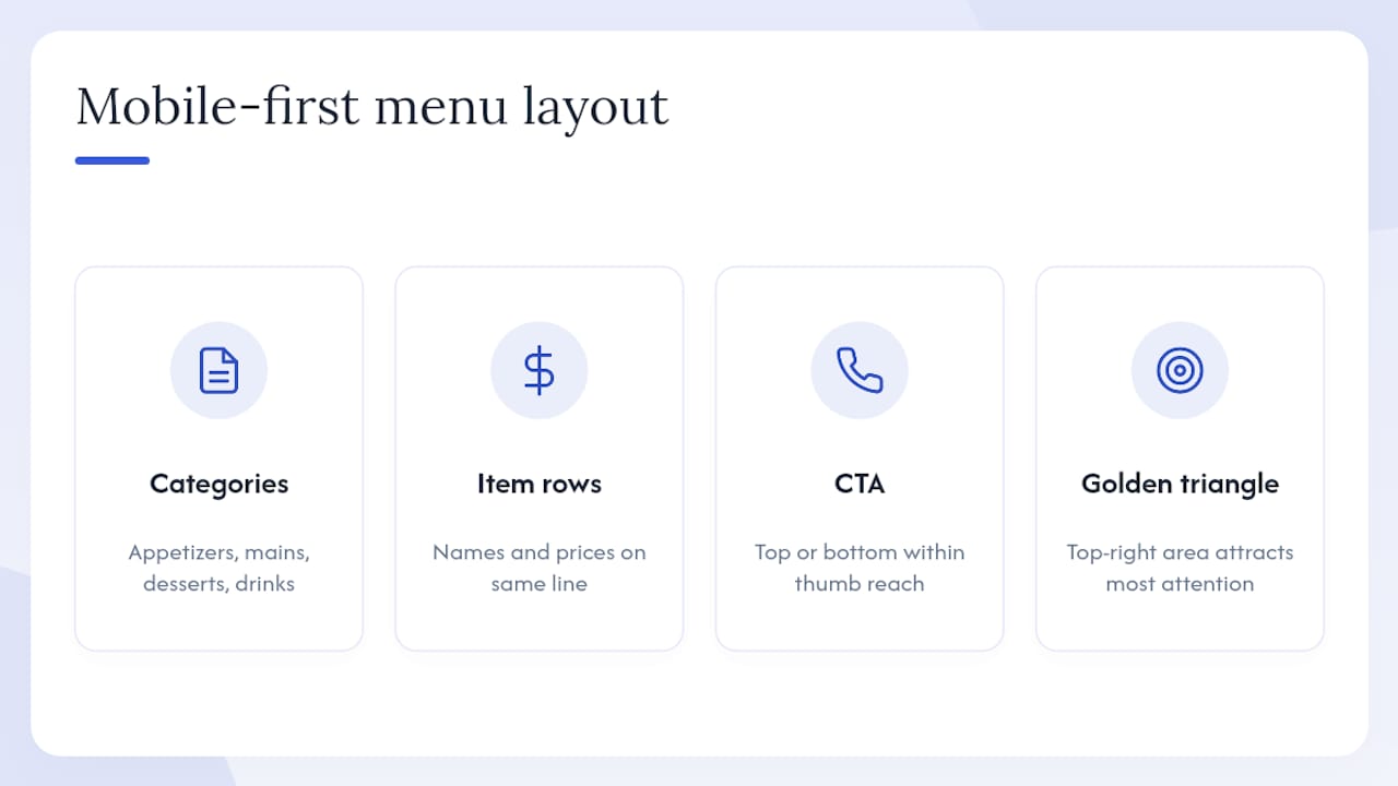
Organize your menu into clear category blocks: appetizers, mains, desserts, drinks. Each category should open without a horizontal scroll. Keep item names and prices on the same line, and put the most important call to action (order now, reserve a table) within thumb reach at the top or bottom of the screen. Menu engineering principles consistently show that items placed in the top-right “golden triangle” of a menu layout capture the most attention.
Typography, contrast, and hierarchy
Use a base font size of at least 16px for body text. Line length should stay between 45 and 75 characters per line for comfortable reading on a phone. Heading hierarchy matters: your category name is H2, your item name is H3, and your description is body text. Never use light gray text on a white background; WCAG 2.1 requires a minimum contrast ratio of 4.5:1 for normal text. Prices deserve their own visual weight, either bold or a slightly larger size, so guests can scan a category at a glance.
Photography that loads fast and looks great
Food photography on a digital menu can lift perceived value significantly, but only if the images load quickly. Compress photos to under 150KB using WebP format and implement lazy loading so images below the fold do not slow the initial page render. Shoot dishes from a 45-degree angle with natural or warm artificial light; flat overhead shots tend to flatten texture and make food look less appetizing. When you reuse or adapt images from external sources, check the license. Creative Commons BY 4.0 permits adaptation but requires attribution, so keep a record of your image sources.
Accessibility and fallback policy
Build your menu as semantic HTML with logical heading structure, descriptive alt text on every image, and keyboard-navigable links. Test on both iOS and Android, including older devices with smaller screens. Run a low-light scan test at an actual table before your launch. And always keep paper menus available; not every guest is comfortable with a phone-only experience, and accessibility law in the United States requires reasonable accommodations.
Pro Tip: Before ordering a full print run of table tents, print one test copy and scan it from every seat in the pilot area, including the seat farthest from the window. Lighting and angle vary more than you expect.
The Figma community template for digital QR menus is a solid starting point for teams that want a pre-built mobile-first layout they can duplicate and adapt to their brand.
Layout Pattern | Best For | Key Characteristic |
Visual-first list | Fine dining, brunch | Hero photo per category, 4–6 signature items |
Compact quick-scan list | Fast casual, lunch | Text-only rows, price right-aligned, no images |
Drinks grid | Bars, cocktail menus | 2-column grid, short names, price below item |
What to write on your menu: copy, pricing, and upsell cues
The words on your menu do as much work as the design. Short, specific descriptions outperform long, flowery ones on a phone screen.
Keep descriptions to 1–2 sentences. Lead with the key ingredient or preparation method (“Slow-braised short rib, red wine jus, roasted garlic mash”) rather than adjectives. Guests want to know what they are eating, not how much you love it.
Price formatting matters. Right-align prices in a consistent column. Drop the dollar sign if your brand allows it; research in menu engineering shows that removing currency symbols reduces price sensitivity. Avoid “.99” endings on high-end menus; they signal value positioning, which can undercut a premium experience.
Dietary and allergen tags. Use a consistent icon set (GF, V, VG, N for nut-containing) and place a small legend at the top of the menu or in a sticky footer. If your restaurant is subject to calorie-disclosure requirements under the FDA’s menu labeling rule for chains with 20 or more locations, link to a full nutritional page rather than cluttering item descriptions.
Built-in upsells. Place suggested pairings directly below an entrée (“Pairs well with our house Malbec”). Use a “Most Popular” or “Chef’s Pick” badge on two or three high-margin items per category. Keep add-ons (extra sauce, side upgrade) as one-tap options near the item, not buried in a separate section.
A restaurant menu design guide that focuses on engagement shows how strategic placement and concise copy work together to lift average check values without pressuring guests.
How to go from blank page to live QR menus in service
This checklist is designed to get a working QR menu into service without a developer on call.
Choose your destination. A mobile HTML page hosted on your own domain or a managed platform is the most flexible option. Avoid linking directly to a Google Drive PDF; those URLs break and load slowly on mobile.
Build and optimize the menu content. Write short descriptions, compress all images to under 150KB, add alt text, and structure the page with semantic HTML headings. Adobe’s workflow guide walks through this in practical detail.
Generate a dynamic QR code. Use a platform that lets you change the destination URL without reprinting. Export the asset as an SVG for your design workflow; SVG scales to any print size without quality loss.
Design and print your table collateral. Add a clear label (“Scan to view our menu”), your logo, and a short URL as a text fallback. Print one test copy first and scan it from multiple seats and angles.
Run real-phone tests on the floor. Test on iOS and Android, in low light, and from the maximum distance a guest might hold their phone. Fix any scan failures before service.
Soft-launch in one area. Brief your staff on the guest flow and give them a short script for guests who need help. Collect feedback for 48 hours, then iterate before rolling out to the full dining room. Keep paper menus available throughout.
For teams migrating from a printed menu, expert guidance on menu digitization covers the staff training and content migration steps that most operators underestimate.
What features should you expect from a QR menu platform?
The gap between a free static QR code and a managed digital menu platform is significant. Here is what the meaningful features actually do for your operation:
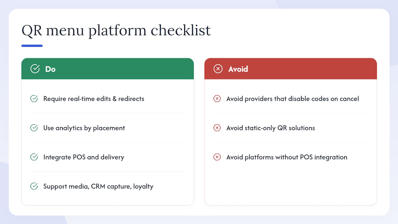
Real-time editing and dynamic redirects mean a price change or a sold-out item is live in seconds, with no reprinting. This alone justifies a paid platform for any restaurant that updates its menu more than once a week.
Analytics by placement let you assign a unique dynamic code to each table zone, the bar, the window, and the patio, so you can see exactly which areas drive the most scans and orders. QRCodeStack’s dashboard approach illustrates how scan counts, device types, and location data combine to give operators a clear picture of placement performance.
POS and delivery integration closes the loop between the guest’s order and your kitchen. Without it, staff must manually re-enter orders, which introduces errors and slows service. Payment options, including pay-at-table, reduce the time a server spends running card terminals.
Multi-language support is not a luxury for restaurants in diverse urban markets. A menu that switches between English and Spanish (or any other language your guests speak) removes friction and signals genuine hospitality.
Media support (video, high-res photography) lets you show a dish being plated or a cocktail being shaken, which tends to lift order rates on high-margin items. Combined with CRM capture via social login and loyalty programs, a managed platform turns a menu into a guest relationship tool.
One operational detail worth checking before you sign up: confirm that your dynamic QR codes remain active if you cancel or downgrade your plan. Some providers disable codes on cancellation, which would break every table code simultaneously. QR Cake’s guidance flags this as a key vendor evaluation criterion.
What does a QR menu actually cost?
Pricing for digital QR menus spans a wide range depending on how much you want to do yourself.
Free static QR generators (QR Code Generator, QRStuff free tier) cost nothing but give you no analytics, no dynamic redirects, and no editing dashboard. They work for a one-time test but become a liability the moment your menu changes.
Managed SaaS platforms typically charge a per-location monthly subscription. Entry-level tiers often include dynamic codes, basic analytics, and a hosted menu page. Higher tiers add POS integration, multi-language support, video, CRM, and loyalty features. Transaction fees may apply on payment and gift voucher features. Mydigimenu’s pricing page shows the tier structure and includes a free trial option so you can test the platform before committing.
One-time design and print costs are separate from platform fees. Budget for table tent design (a designer or a Figma template), printing, and lamination or acrylic holders for durability.
The honest budget picture includes three often-overlooked line items: staff training time (typically a few hours for a full team), a 30–90 day iteration window where you will be tweaking copy and images, and the cost of keeping paper menus available as a fallback. Factor all three in before comparing platform prices.
Design examples and templates you can use right now
Three layout patterns cover the vast majority of restaurant use cases.
Visual-first list (fine dining, brunch). A hero photo anchors each category, with four to six signature items below it. Descriptions run two sentences. Prices are right-aligned. This layout works when photography is strong and the menu is short.
Compact quick-scan list (fast casual, lunch counters). Text only, no images, with item name on the left and price on the right. Categories are separated by a bold header and a thin rule. This layout loads instantly and works well on older phones with slower connections.
Drinks grid (bars, cocktail menus). A two-column grid with the drink name, a one-line description, and the price below. Icons indicate spirit base or flavor profile. This pattern lets guests scan a large drinks list without endless scrolling.
For visual inspiration, Pinterest’s curated QR menu board shows real-world table tents, window decals, and styling patterns from restaurants across different service formats. Dribbble’s QR code menu search surfaces designer-contributed mockups useful for detailed compositional decisions. The Figma community template is the fastest path from inspiration to a production-ready file your team can adapt.
When adapting an existing PDF for mobile, the most common mistake is keeping the two-column landscape layout. Reflow everything into a single column, increase font sizes, and replace any embedded images with properly compressed web images.
How to print and place codes so they actually scan
Print size is the most underestimated variable in QR menu deployment. QR Cake recommends a minimum printed size of approximately 2.5cm × 2.5cm (roughly 1 inch × 1 inch) for tableside scanning, but a 4cm × 4cm (about 1.5 inches × 1.5 inches) code is more reliable across a range of phone cameras and lighting conditions. The general rule of thumb: the scan distance should be no more than ten times the code’s printed width.
Contrast is non-negotiable. Dark code on a light background scans reliably; light code on a dark background is technically possible but fails more often in low light. Avoid printing on glossy surfaces without a matte laminate overlay; glare from overhead lighting can make a code unscannable. Always maintain the quiet zone (the white border around the code) at a minimum of four modules wide.
For materials, matte-laminated card stock is the practical choice for table tents: durable, easy to wipe down, and glare-free. Acrylic or metal standees add a premium feel and last longer in high-traffic environments. Window stickers work well for takeout and delivery pickup points. Bar toppers (small tent cards placed along the bar rail) are effective for cocktail menus and daily specials.
MakeQRCode’s AI-assisted workflow recommends exporting your QR asset as an SVG before placing it in a print layout; SVG files scale to any size without pixelation, which prevents the blurry codes that fail to scan.
How to measure success and keep improving
Tracking the right metrics turns a QR menu from a static tool into a continuous improvement engine.
Scans per seat per service. Divide total daily scans by your seat count to get a baseline engagement rate. A low rate often points to a placement or lighting problem, not a menu problem.
Menu views to order conversion. If guests are scanning but not ordering, the friction is in the menu itself: slow load times, confusing navigation, or a missing call to action.
Average check per scanner. Compare this against your overall average check. A meaningful gap suggests the menu is not surfacing upsells effectively.
Time on menu. Very short sessions (under 20 seconds) suggest guests are bouncing; very long sessions (over 5 minutes) may indicate confusion in the navigation.
Structure your UTM tags by placement: utm_source=table&utm_medium=qr&utm_campaign=zone_a for table zone A, a separate tag for the bar, another for the patio. This keeps your analytics clean and lets you compare placement performance directly.
Two quick A/B tests worth running in your first month: swap the order of your top two categories and watch whether scan-to-order conversion changes, and move your highest-margin item to the first position in its category for two weeks. Both tests require no design changes, just a content edit in your dashboard.
A practical iteration cadence: review scan data weekly, refresh item copy and photography monthly, and audit the full menu layout quarterly. That rhythm keeps the menu current without consuming your team’s time.
Why managed platforms usually win for busy restaurants
The DIY path has genuine appeal. Free QR generators and a well-built HTML page can get you live in a day, and you retain full control over every pixel. For a single-location operator with a stable menu and a developer on staff, that route is entirely reasonable.
The reality for most restaurant operators is different. Menus change constantly, service staff do not have time to troubleshoot scan failures during a Friday dinner rush, and the analytics that actually drive decisions (conversion by placement, check lift from upsell placement) require a dashboard that a hand-coded HTML page cannot provide. A managed platform absorbs that operational risk and centralizes updates in a tool that any manager can use without touching code.
The trade-off is cost and dependency. A SaaS subscription is an ongoing expense, and you are trusting a vendor’s uptime and support quality. That is why the code-persistence question matters so much: a vendor that disables your QR codes on cancellation holds your tables hostage. Choose a platform that guarantees code persistence and has a clear uptime SLA.
For venues that want to go further than a phone-based menu, a tablet and iPad menu option alongside QR codes gives guests a choice and covers service formats where a shared device makes more sense than a personal phone.
Mydigimenu brings all of this together in one place
Running a great restaurant is hard enough without managing a patchwork of QR generators, image hosts, and analytics tools. Mydigimenu is built specifically for hospitality operators who want real-time menu editing, POS integration, multi-language support, and mouthwatering food video, all from a single dashboard. Update a price, swap a photo, or launch a daily special in seconds, with no developer and no reprinting.
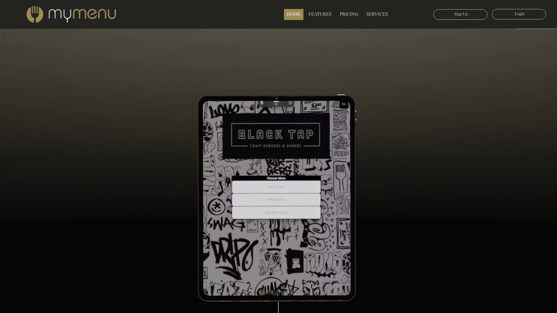
The platform supports pay-at-table, CRM capture, loyalty programs, and delivery portal connections, so your QR menu becomes the hub of your guest experience rather than just a link to a PDF. Operators who want an on-premise option can pair QR menus with Mydigimenu’s tablet menu solution for a complete multi-device setup. A free trial is available, and transparent pricing plans make it easy to find the right tier before you commit. Start your pilot today at Mydigimenu.
Sources
These resources cover every stage from design to deployment.
Recommended
Comments