
Menu Allergen Icons: Comply With US Law and Cover All 9 Allergens

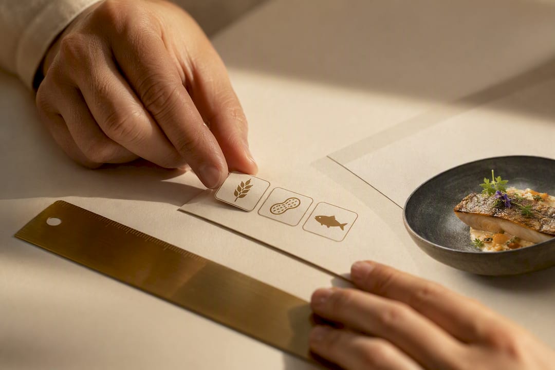
Use official pictogram sets (from industry associations and government food agencies) for consistency, supplement with commercial libraries like Flaticon or Noun Project when you need broader style coverage, and always keep an SVG master with PNG and PDF exports for print. Icons alone rarely satisfy the law. Most US jurisdictions expect a visible legend plus written allergen names, so treat every icon as a visual shortcut, never a substitute for text.
TL;DR:
Use official or commercial icon sets that include all nine FDA-recognized allergens, ensuring style consistency and editable vector files for flexibility.
Icons should accompany a visible legend and written allergen names, with placement varying between inline for simple dishes and legend references for complex menus.
Digital menus must map allergens at the item level and provide accessible allergen disclosures both on-screen and via printed or staff-assisted alternatives.
Export icons in SVG format with high contrast, appropriate sizing, and 300 DPI resolution for print, and ensure web-optimized PNGs are available for digital use.
Most laws require icons to be supplemented with text and a visible legend, not used as standalone disclosures, with item-level mapping and staff training being key compliance factors.
Table of Contents
What Are Allergen Icons, and Where Do You Download Standardized Sets?
What Allergens Must You Disclose, and What Does the Law Require?
How Do You Place Icons on a Menu So Guests Actually Understand Them?
What Technical Specs Keep Allergen Icons Legible Across Print and Screen?
Get Your Allergen Icons Live Without Building a Menu System From Scratch
What Are Allergen Icons, and Where Do You Download Standardized Sets?
Menu allergen icons are small pictograms, a wheat stalk, a peanut, a fish outline, that flag which of the major allergens appear in a dish. They speed up scanning for guests with dietary restrictions, but the icon itself is only half the system. The other half is a source you can trust and a format that survives the trip from your design software to a laminated table card.
Two categories of sources cover almost every operator’s needs. Official industry and food-safety pictogram sets, the kind referenced in International Association for Food Protection materials and adapted from government guidance, give you consistent, recognizable shapes that guests may already know from packaged food labels. Government agencies like the UK’s Food Standards Agency publish downloadable allergen matrices and poster templates that many US operators adapt for their own menus, since no single global icon standard exists. Commercial libraries such as Flaticon and Noun Project fill the gaps: broader style packs, more design flexibility, and icon sets that match a particular menu aesthetic rather than a strictly clinical look.
Before you commit to a set, run it through a short checklist:
Coverage. Does it include icons for all nine major US allergens, not just the common four or five?
Style consistency. Do all icons share the same line weight, fill style, and visual language, or will guests see a mismatched patchwork?
Editable source files. Can you get a true vector master, not just a flattened PNG, so you can recolor or resize without quality loss?
License terms. Does the license explicitly permit commercial menu use, including printed and digital reproduction?
Confirm format availability before downloading. Reputable sets typically ship as SVG, PNG, EPS, and PDF, with some offering PPTX for teams that build printed table cards directly in PowerPoint.
What Allergens Must You Disclose, and What Does the Law Require?
The FDA designates nine allergens as the ones operators need to prioritize: milk, eggs, fish, crustacean shellfish, tree nuts, peanuts, wheat, soybeans, and sesame. Any icon set worth downloading needs to cover all nine, since sesame joined the list more recently than the other eight and older icon packs sometimes miss it.
The compliance reality: Icons are frequently permitted as a visual aid, but they are rarely permitted alone. California’s SB-68, part of the state’s Allergen Disclosure and Death Prevention effort, requires item-level written notification of major allergens for covered facilities, and it allows pictograms only when a visible legend and an alternative access method exist for guests who cannot use a digital menu.
That last clause matters more than most operators realize. If your allergen disclosure lives entirely inside a QR-code menu, SB-68 and similar frameworks expect you to also offer a printed version or a staff member trained to answer the same questions on the spot. Legal analysts covering the law note that a general disclaimer does not satisfy the requirement; each menu item needs its own mapped allergen list, and the icons are a layer on top of that mapping, not a replacement for it.
Turning this into daily practice takes three moves:
Map every menu item to its allergens individually, ingredient by ingredient, rather than applying a blanket kitchen-wide warning.
Keep a printed allergen matrix or a staff-assisted lookup ready for guests who cannot or prefer not to use a phone.
Train staff to answer allergen questions for any item on the menu, since a guest asking at the table is still your first line of disclosure.
How Do You Place Icons on a Menu So Guests Actually Understand Them?
Placement decides whether your icon system helps guests or just decorates the page. You have two basic options, and most well-run menus use both.
Inline icons, small symbols sitting directly next to a dish name, let guests scan quickly without hunting for a key. They work best on printed menus with generous white space. The tradeoff: cram too many icons next to one item and the page starts looking cluttered, especially on dishes with four or five flagged allergens.
Legend-based systems list every icon once, in a single reference block, then mark each dish with a small superscript or footnote number. This scales better for complex menus and keeps the page visually clean, but it forces the guest to cross-reference, which only works if the legend sits somewhere they will actually see it.
Here is a practical sequence for combining both approaches without confusing anyone:
Place the legend at the top of the menu or immediately at the point of ordering, printed large enough to read without squinting.
Use inline icons for dishes with one or two allergens; switch to legend-referenced numbers once an item carries three or more.
Order icons consistently, always allergens before dietary tags like vegetarian or gluten-free, so guests learn the pattern after one page.
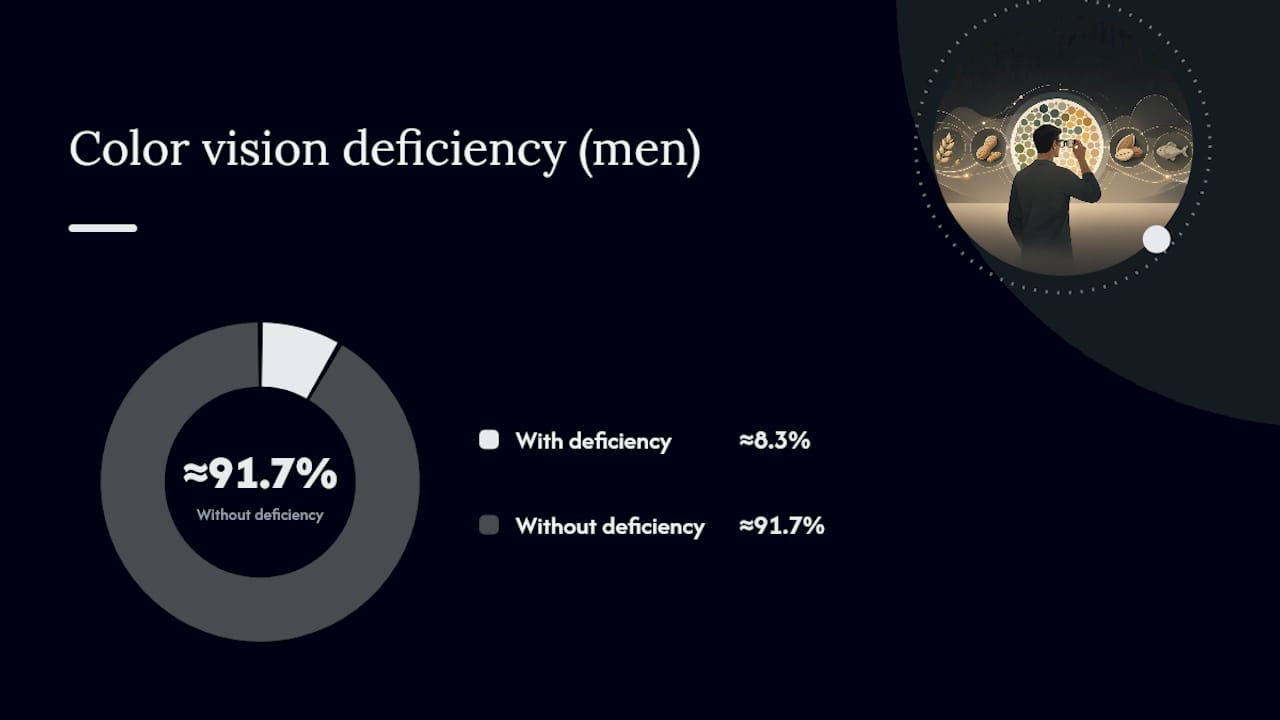
Never rely on color alone to distinguish icons. Roughly 1 in 12 men have some form of color vision deficiency, so pair color with distinct shapes and, where possible, a text label.
On digital menus, add descriptive alt text to every icon image so screen readers announce the allergen name, not just “icon.”
Pro Tip: Run a five-minute staff briefing every shift change where servers name the top three allergens they’re most likely to be asked about that day, based on specials. It keeps allergen knowledge sharp without turning training into a once-a-year binder review.
Guidance from food-safety researchers backs this dual approach: icons work best as a secondary cue layered over written allergen names, not as a standalone system.
What Technical Specs Keep Allergen Icons Legible Across Print and Screen?
Vector format wins for almost every use case. SVG files scale cleanly from a tiny mobile tap target to a large printed poster without losing edge sharpness, and they stay small enough in file size to load instantly on a QR-menu landing page. Reserve raster formats like PNG or JPEG for situations where a platform doesn’t accept vector uploads, and even then, export at 2x resolution so icons stay crisp on high-density phone screens.
For print materials, aim for 300 DPI minimum, the standard for legible text and icons on laminated cards or table tents. Below that threshold, edges soften and small allergen symbols blur into unreadable smudges under restaurant lighting.
Size matters just as much as resolution. Icons printed smaller than roughly 0.25 inches tend to disappear against busy menu backgrounds, and on touchscreens, any tappable icon needs a minimum target size, generally around 44 by 44 pixels, so guests with larger fingers or motor impairments can select it accurately. Contrast follows a similar logic: icons should meet a contrast ratio that satisfies WCAG accessibility guidance against their background, since a pale yellow peanut icon on a cream menu background defeats the entire purpose of the system.
Before you finalize a set, run through this export checklist:
Keep one editable vector master file with separate layers for fills and strokes, so recoloring doesn’t require rebuilding icons from scratch.
Export with transparent backgrounds so icons drop cleanly onto any menu color scheme.
Standardize on one color palette across all icons, avoiding the mismatched look that happens when icons come from three different libraries.
Generate web-optimized PNG exports alongside your SVG master, since some digital menu platforms still request raster fallbacks.
How Do You Add Allergen Icons to a Digital or QR-Code Menu?
Digital rollout follows a tighter sequence than print, mainly because QR-code menus carry the extra obligation of proving an alternative exists for guests who can’t or won’t scan a code.
Prepare your assets first. Finalize the vector icon set, confirm all nine major allergens are covered, and export both SVG and PNG versions before touching your menu platform.
Map icons to items at the data level, not just visually, so each dish carries its allergen tags as searchable metadata rather than a decorative afterthought.
Publish the legend on the same screen guests land on after scanning, never buried two taps deep, since SB-68 style requirements expect the disclosure to be genuinely visible at the ordering point.
Test across devices before launch, checking that icons render at readable size on both an iPhone screen and an older Android tablet mounted at the host stand.
Keep a printed or staff-assisted alternative on hand, since digital-only disclosure still needs a fallback for guests without smartphones or reliable signal.
Platforms like Mydigimenu’s QR menu tools handle the item-level metadata and nutritional fields that make this mapping practical rather than a manual spreadsheet exercise.
Where to Download Icon Sets and Templates First
Start with government-published resources, which tend to be free and legally grounded: GOV.UK’s allergen matrix and poster templates give you an editable structure to adapt for US allergens. For icon variety, Flaticon and Noun Project offer searchable libraries with commercial licenses. Developers managing multi-region menus sometimes reference open datasets like Menuella’s food-safety repository for standardized keys across languages.
Your first three downloads should be an SVG master icon set covering all nine FDA allergens, an editable allergen matrix in PPTX or PDF for front-of-house training, and a printable legend sized for table tents or menu inserts, as explained in the role of online food ordering for restaurants and customers on Wild Foodz by Hotel Entree Brugge.
What Most Operators Get Wrong About Allergen Icons
Most advice on this topic treats icons as a design problem. It isn’t. It’s a data-mapping problem wearing a design costume. The operators who get into trouble aren’t the ones with ugly icons, they’re the ones who dropped a pretty peanut symbol next to a dish without ever verifying, ingredient by ingredient, that the mapping was accurate and current after a recipe change.
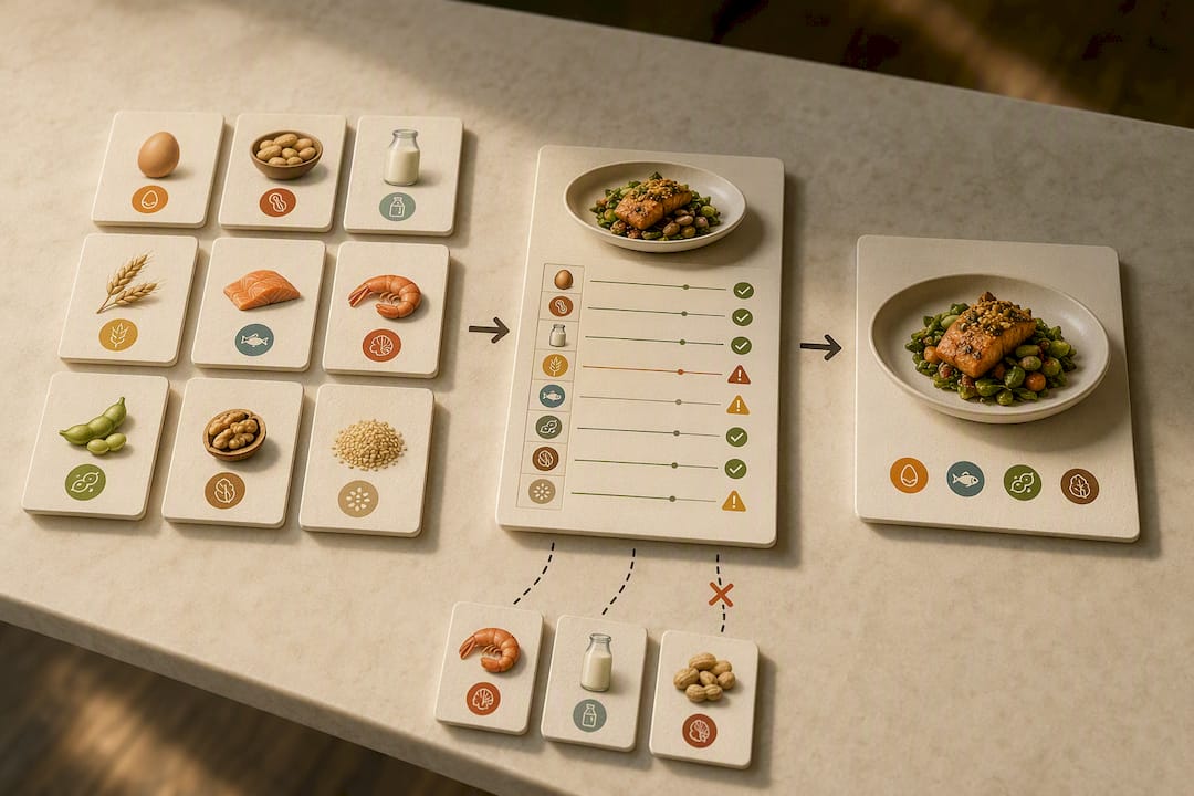
The conventional wisdom says “add icons, look compliant.” The more useful version says “map every item to its allergens first, then let icons visualize a system you’ve already built.” SB-68’s item-level requirement exists precisely because pictograms without underlying data are cosmetic, not protective.
If you take one thing from this article, prioritize the legend and the written names over the icon style. A guest with a tree nut allergy needs the word “walnut” somewhere accessible far more than they need a beautifully rendered nut icon. Build the text-based foundation first. Layer icons on top for speed, not as the whole system. Digital menu platforms that store allergen data at the item level, rather than as a static image, make it far easier to update that foundation the moment a recipe changes.
— Abhi
Get Your Allergen Icons Live Without Building a Menu System From Scratch
Downloading the right icon set solves half the problem. Getting it onto a menu that updates instantly when a recipe changes, and shows a visible legend the moment a guest scans a code, solves the other half. Some platforms provide a way to store allergen data at the item level rather than as a flat image, so when a supplier swaps an ingredient, the disclosure updates everywhere at once instead of requiring a reprint.
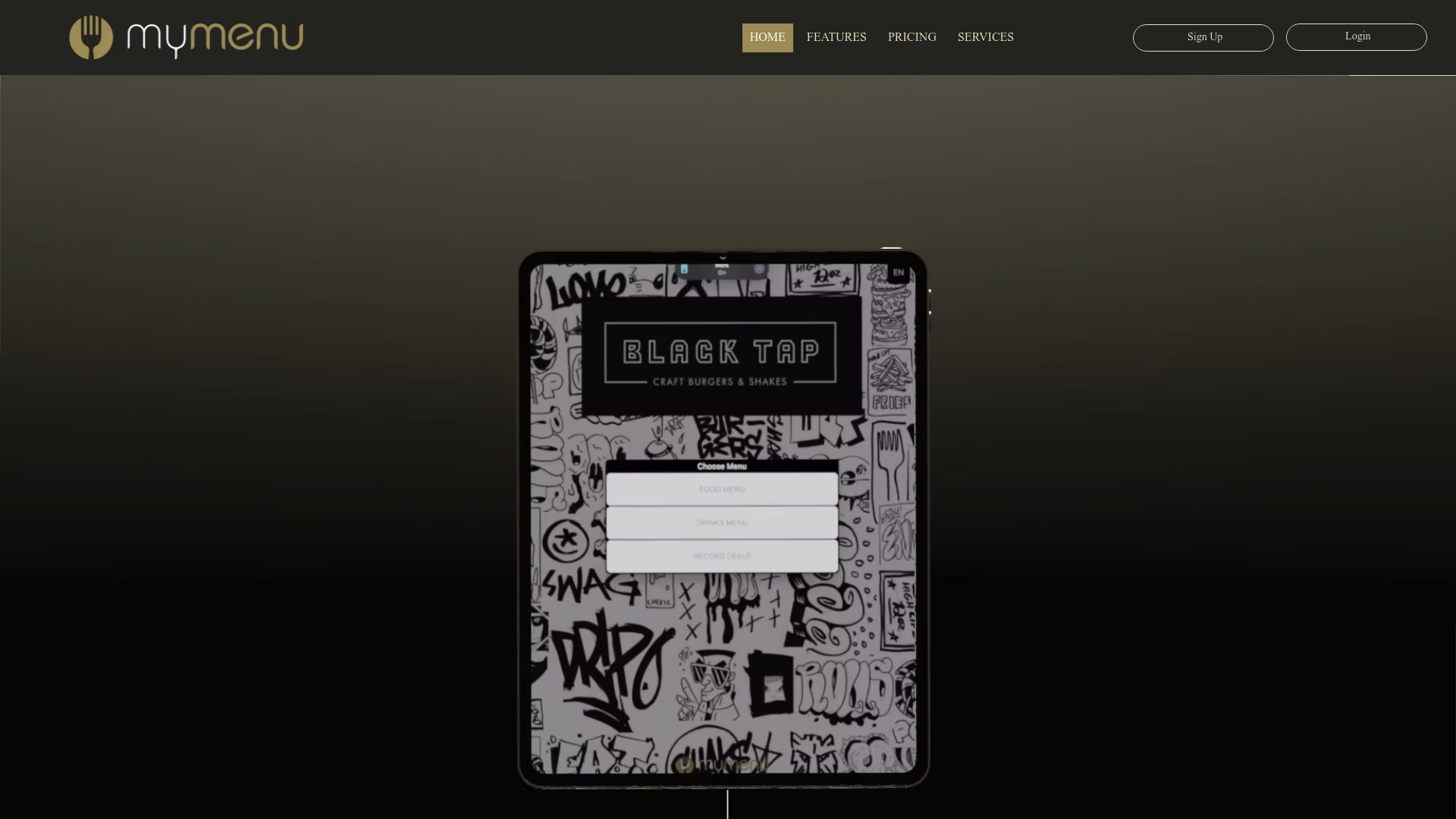
The platform’s digital tablet and iPad menu tools let you attach allergen icons, nutritional fields, and written allergen names to each dish, with the legend displayed on the same screen guests land on. Its QR menu generator supports the same item-level mapping for contactless ordering, keeping your icon system consistent whether a guest is scanning a table code or browsing a tablet menu at the host stand. If you’re ready to move your allergen disclosures off a static PDF and onto a system built to update in real time, consider exploring digital menu setups that enable quick real-time updates of item-level allergen data.
Sources
FAQ
How do you display allergens on a menu?
Pair a consistent icon set with a visible legend and written allergen names, placed either inline next to each dish or referenced through footnote numbers tied to a legend block guests see before ordering.
Where can I download free menu allergen icons?
Government resources like GOV.UK’s allergen guidance offer editable matrices and poster templates at no cost, while commercial libraries like Flaticon and Noun Project provide broader style options under free or paid licenses.
Where can I find allergen information on my menu?
Look for a legend, usually near the top of a printed menu or on the landing screen of a QR-code menu, that explains what each icon represents alongside written allergen names for each dish.
What are the major food allergens?
The FDA designates nine major allergens: milk, eggs, fish, crustacean shellfish, tree nuts, peanuts, wheat, soybeans, and sesame, and any complete icon set should cover all nine.
Do allergen icons alone satisfy legal requirements?
Rarely. Laws like California’s SB-68 generally require icons to be paired with a visible legend, written allergen names, and a printed or staff-assisted alternative for guests without digital access.
Recommended
Comments