
Boost sales with visual content in restaurant menus
- Abhi Bose
- Apr 17
- 8 min read

TL;DR:
Visual content activates appetite more effectively than text, increasing guest engagement and sales.
High-quality food photos and short videos are the most impactful visual tools for menus.
Tailoring visuals to guests’ age and preferences ensures better navigation and higher satisfaction.
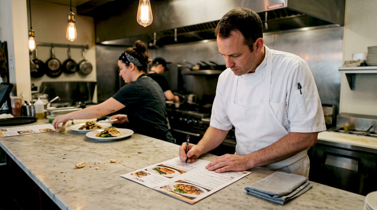
A single mouthwatering photo can do what a paragraph of text simply cannot: make a guest’s mouth water before they’ve read a single word. Most restaurant owners invest heavily in food quality and service, yet overlook the silent salesperson sitting right on the table. Research confirms that visual stimuli activate appetite more powerfully than text, shaping what guests order and how much they spend. This guide walks you through the psychology behind menu visuals, the types that work best, how to tailor them to your guests, and a clear action plan to turn your digital menu into a genuine revenue driver.
Table of Contents
Key Takeaways
Point | Details |
Images drive choices | Visual content in menus captures attention and directly influences what guests order. |
Select visuals strategically | Photos, icons, and videos each play a role—choose based on your audience for best results. |
Design for all ages | Blending digital and print-inspired layouts improves accessibility, especially for older diners. |
Continuous improvement matters | Test, gather feedback, and adapt your visual menu approach to maximize engagement and sales. |
Why visual content matters in restaurant menus
Visuals are not decoration. They are decision-making tools that work quietly in the background every time a guest browses your menu. When a diner sees a beautifully plated dish, their brain begins simulating the experience of eating it, a process researchers call “consumption vision.” That mental rehearsal makes the dish feel more desirable, more real, and ultimately more worth ordering.
The science backs this up convincingly. A Wiley study found that visual stimuli outperform text in activating consumption vision and shaping positive attitudes toward menu items. Text descriptions, no matter how poetic, engage a different, slower cognitive pathway. Visuals bypass that deliberation and speak directly to appetite and emotion.
“A well-placed image doesn’t just show a dish, it sells the experience of eating it before the guest has even decided.”
For restaurant owners, this distinction is worth real money. When guests connect emotionally with a dish through an image, they are more likely to order it, less likely to hesitate over price, and more inclined to add extras. Thoughtful menu design strategies that prioritize visual hierarchy can amplify these effects significantly.
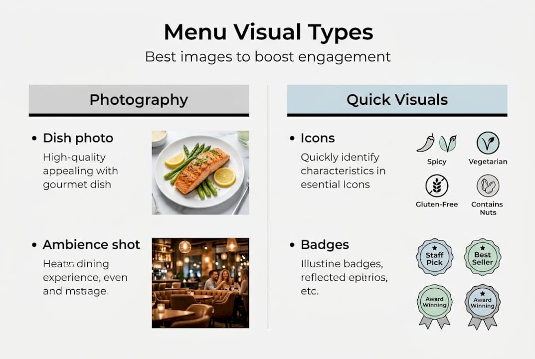
The most effective visual elements in restaurant menus include:
Dish photography: Authentic, high-resolution images that capture texture, color, and portion size
Icons and badges: Symbols for allergens, spice levels, chef’s picks, or vegan options that guide decisions at a glance
Illustrations: Hand-drawn or branded artwork that reinforces your restaurant’s personality and atmosphere
Short food videos: Brief clips showing a dish being plated or a drink being poured, creating movement and excitement
Each of these elements serves a different purpose, but together they create a menu experience that feels alive. Restaurants that boost guest engagement through rich visual content consistently report higher average check sizes and stronger repeat visit rates. The visual layer of your menu is not a luxury. It is a competitive necessity.
Key types of visual content that increase engagement
Not all visuals are created equal. Choosing the right type for your menu depends on your concept, your guests, and the story you want each dish to tell. Here is a clear comparison to help you prioritize.
Visual type | Engagement strength | Best use case | Key consideration |
Food photography | Very high | Hero dishes, specials | Must be authentic, not stock |
Icons and badges | Medium | Dietary info, highlights | Keep simple and recognizable |
Illustrations | Medium | Brand storytelling | Works best for themed concepts |
Short food videos | Very high | Signature dishes, drinks | Requires good lighting and editing |
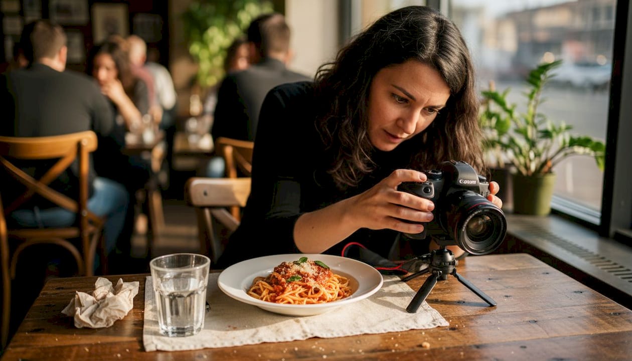
Food photography remains the most powerful single tool in your visual menu arsenal. A stunning image of your signature pasta or a perfectly poured craft cocktail can increase that item’s order rate noticeably. The key is authenticity. Guests have developed a sharp eye for stock photos, and using them signals a disconnect between what they see and what arrives at the table. Professional plating presentation tips can help your dishes look as spectacular in photos as they taste in person.
Short food videos are rapidly becoming the most exciting frontier in digital menu design. Explore video menu strategies to see how a 10-second clip of cheese pulling away from a pizza or a cocktail being flamed tableside can ignite desire in a way no static image can match.
Icons and badges, while subtler, carry significant practical value. They help guests filter quickly by dietary needs, which reduces ordering friction and builds trust. For menu layout examples that show how icons integrate cleanly into a digital design, the difference in clarity is immediately visible.
Pro Tip: Photograph your actual dishes under natural or warm artificial light, not harsh overhead lighting. Hire a food photographer for your top 10 to 15 items and use those images consistently across your digital and print materials. Consistency builds trust.
Research confirms that photos boost engagement, though designers should note that guests over 50 may find heavily image-driven layouts harder to navigate. Blending familiar, print-inspired layouts with digital-native visual richness creates the best of both worlds.
Designing with your audience in mind
Knowing which visuals to use is only half the equation. The other half is knowing who you are designing for. Your guests are not a monolith. Age, familiarity with technology, and dining context all shape how people interact with a visual menu.
Here is how different age groups typically engage with menu visuals:
Age group | Preferred visual style | Key design priority |
18 to 34 | Video, bold photography, interactive | Speed and visual excitement |
35 to 49 | High-quality photos, clean icons | Balance of visuals and information |
50 and above | Clear images, familiar layouts | Readability and ease of navigation |
The data is clear: older users over 50 may struggle with heavily digital-native designs, making it essential to blend printed-inspired layouts with modern visual elements. Ignoring this segment means leaving a significant portion of your dining room feeling frustrated rather than delighted.
Here is a practical approach to blending classic and modern design for broad appeal:
Start with a familiar grid layout that mirrors the structure of a traditional printed menu, with clear categories and logical flow.
Layer in high-quality photos for your top sellers and seasonal specials, keeping white space generous so the menu breathes.
Add icons sparingly for dietary flags and chef recommendations, using universally recognized symbols.
Introduce video or animation only for one or two signature items to create moments of delight without overwhelming the experience.
Test with real guests across age groups before a full rollout, gathering feedback on readability, visual appeal, and ease of use.
Exploring blended menu layouts gives you a practical sense of how these principles translate into real designs. You can also review customizable menu layouts to find formats that adapt to your specific guest profile.
Pro Tip: Run a simple usability test by asking five guests from different age groups to find a specific item on your digital menu. Watch where they hesitate. Those friction points are your redesign priorities.
From design to results: Practical steps to implement visual menus
Understanding the theory is one thing. Putting it into practice in a busy restaurant environment is another. Here is a clear, repeatable framework for rolling out visual menu improvements that actually move the needle.
Audit your current menu visuals. Identify which dishes have photos, which do not, and which images are outdated or low quality. Prioritize your highest-margin and most-ordered items first.
Plan a photo and video shoot. Schedule a session during off-peak hours with a professional photographer. Focus on your top 15 items and any seasonal specials you want to promote.
Brief your team. Your front-of-house staff should understand the visual menu’s purpose and be able to guide guests who need help navigating it. Engagement starts with your people.
Roll out in phases. Launch with your updated hero item images first, then add icons and video content progressively. A phased approach reduces disruption and lets you measure impact at each stage.
Collect structured feedback. Use your digital menu platform’s built-in feedback tools or simple post-meal surveys to gather guest reactions to the new visuals.
Analyze dish performance data. Track order rates for visually enhanced items versus those without updates. The numbers will tell you exactly where visuals are driving sales.
Iterate regularly. Swap in seasonal imagery, refresh photos for new dishes, and retire visuals that no longer reflect your current menu. A living menu outperforms a static one every time.
The payoff is real. Boosting engagement by 15% through smart menu design is an achievable benchmark for restaurants that commit to the process. Combining this with digital food signage tips and a solid menu digitization guide creates a full ecosystem of visual influence that works around the clock.
Key insight: Restaurants that close the feedback loop between visual content updates and sales data consistently outperform those that treat their menu as a one-time design project.
What most restaurants get wrong about visual menu content
Here is an uncomfortable truth: more visuals do not automatically mean better results. Many restaurants make the mistake of adding photos to every single item, flooding the menu with imagery until nothing stands out. When everything is highlighted, nothing is. The menu becomes visual noise rather than a curated guide.
The restaurants that truly win with visual content are selective. They treat their menu like a gallery, choosing which dishes deserve the spotlight and letting the rest breathe with clean text. They use real dish photography, not aspirational stock images that set expectations the kitchen cannot meet. And they refresh their visuals seasonally, turning the menu into a living reflection of what is actually on the plate today.
Personalized and seasonal visuals are the most underused competitive edge in the industry. A summer cocktail photo in January feels lazy. A freshly shot autumn harvest bowl in October feels intentional and exciting. Guests notice. Investing in expert menu digitization means building a system that makes these updates easy, not a burden. The restaurants that treat visual content as an ongoing strategy rather than a one-time project are the ones guests remember and return to.
Take the next step with My Menu solutions
The strategies in this guide are proven, but they require the right platform to bring them to life efficiently. MyDigiMenu.com gives restaurant owners and managers the tools to apply every visual content principle covered here, without the technical headaches.
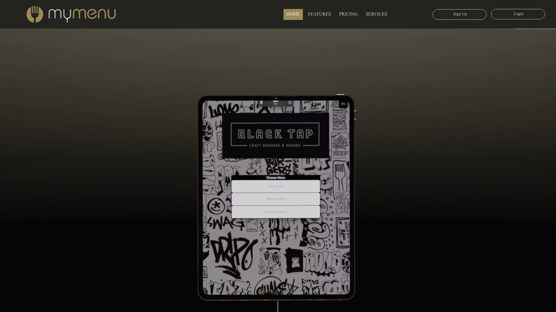
From a fully customizable restaurant digital tablet menu that showcases your best dish photography and food videos, to an instant QR menu generator that puts your visual menu in every guest’s hands without an app download, the platform is built for results. Explore flexible options at digital menu pricing and find the plan that fits your restaurant’s goals. Turning great food into great visuals has never been more accessible.
Frequently asked questions
How do photos in digital menus impact customer decisions?
Photos in digital menus stimulate appetite and encourage ordering by making dishes more appealing than text descriptions alone. Visual stimuli outperform text in activating the mental experience of eating, which directly influences what guests choose.
What’s the best type of visual for restaurant menus?
Appetizing, authentic food photos have the most impact on guest decisions. Photos boost engagement strongly, and icons and short videos add further value when used with purpose rather than as filler.
How can I make digital menus easier for older guests?
Use clear, large images alongside generous text and familiar layout structures. Older users over 50 navigate digital menus most comfortably when print-inspired design cues are blended with modern visual elements.
Can visual content actually increase my restaurant’s sales?
Yes, consistently. Well-designed visual menus drive measurably higher engagement and order rates for featured dishes. Boosting engagement by 15% is a realistic and documented outcome for restaurants that invest in quality visual menu content.
Recommended
Comments